If you’re looking for the best WordPress page builder, you might be interested in comparing Elementor vs Breakdance. Both are popular page builders capable of letting you design your entire site. They both have modern, user-friendly interfaces. They also both have some advanced features for more technical users.
But there are some key differences between the two which might change your decision. In this article, we’ll explore those differences and help you decide which builder is best for you: Elementor, or Breakdance?
Below, we’re going to dive deep on 9 key aspects in Elementor vs Breakdance to determine which one is the best fit for you. Here are the topics we will be exploring:
- Interface. Which has the best user experience and workflow?
- Performance. Does Elementor produce the most performant sites, or does Breakdance?
- Elements and Widgets: Which visual site builder has the best selection of elements or widgets?
- Global Styling: Will Breakdance streamline your design process with global styles, or will Elementor?
- Theme Builder: Which tool’s theme building capabilities are the best?
- WooCommerce Builder: We’ll pit Elementor vs Breakdance in a head-to-head WooCommerce showdown.
- Template Library: How does Breakdance’s pre-built template library stack up against Elementor’s site kits?
- Dynamic Data: Which builder’s dynamic data tools allow you to build advanced, data-driven sites quickly and easily?
- Pricing Plans: Cost is always a factor. Which builder is best for your budget?
If you want to find out more about these two builders, let’s dive into the comparison and get to the bottom of the Elementor vs Breakdance debate.
Breakdance Overview
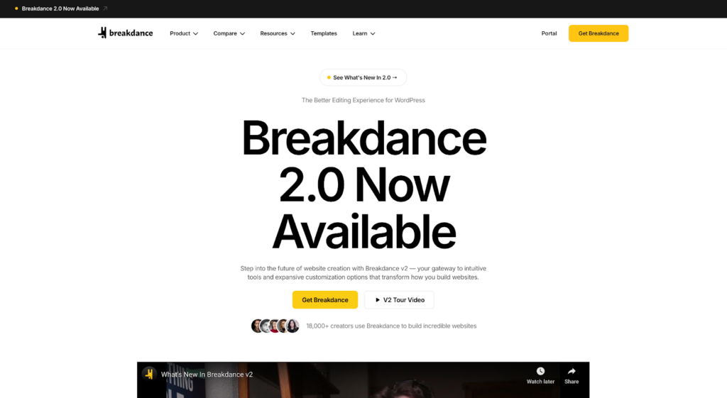
Launched in September of 2022, Breakdance is the modern take on a visual site builder for WordPress. Sometimes called “page builders”, most of these tools, like Breakdance, have evolved beyond just building page layouts and content. In fact, almost every major “page builder” now has full theming capabilities, allowing you to design your headers, footers, and post or archive templates using the builder interface.
Breakdance is no exception. With a decidedly new-school approach focused on ease of use, clean UI, performance, accessibility, and efficiency, Breakdance is a nod to the strides we’ve made since the page builder craze started in 2016.
We’ve come a long way since then, and Breakdance leverages modern technology (rather than building on top of old, dated tech) to provide a smooth, responsive user experience that you won’t soon forget.
But don’t let the polish fool you. Just slightly below the user-friendly exterior lies an unprecedented amount of power – exactly what advanced users are looking for. It’s there if you need it, and quietly tucked away when you don’t. The perfect blend of newbie friendly and professional power, finally united.
Elementor Overview
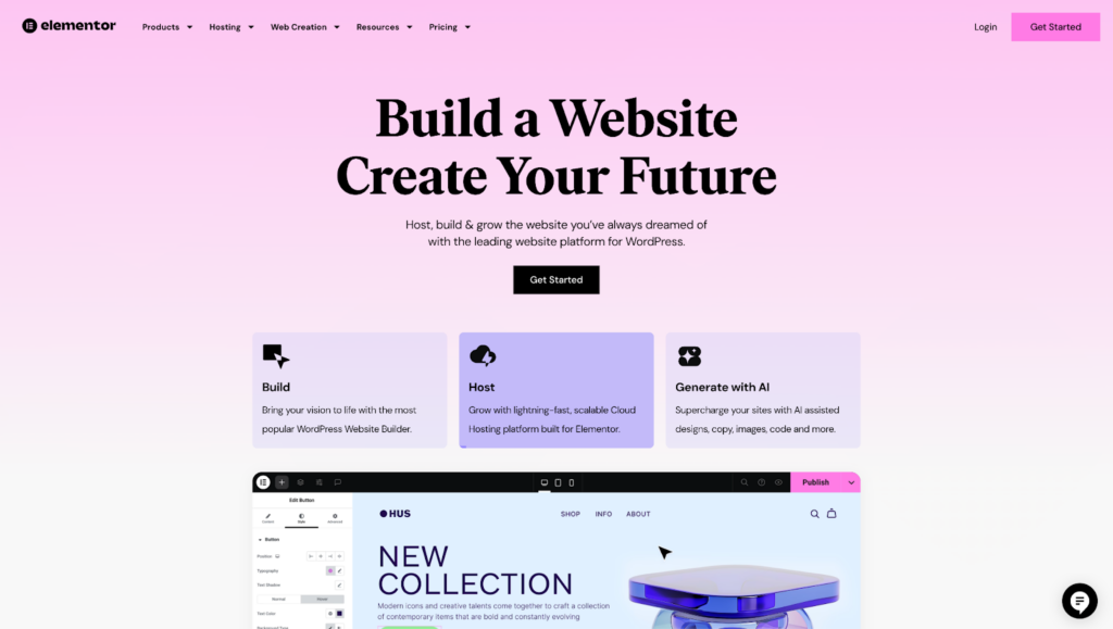
Launched in 2016, Elementor is a household name when it comes to page builders. It has cemented itself as one of the most successful products in the space, especially when it comes to its free version, with a large user base and a slowly growing feature set.
With a clean, user-friendly UI, Elementor is attractive to designers, DIYers, and generally non-technical users. It focuses heavily on using pre-made elements and templates, and deeper customization, while possible, isn’t a primary concern for most Elementor users.
Unfortunately, for builders like Elementor which started before some newer technology was available, there can be a struggle when it comes to accessibility, performance (back-end and front-end), and overall usability.
In recent years, the company behind Elementor has turned its sights to offerings such as hosting, AI site builders, image optimization, and some other side ventures.
Unfortunately, this has left some doubts in the minds of long-time users who still struggle with instability when it comes to updates, as well as some missing features that are expected from site building tools today.
Now that you know a bit more about the contenders, let’s take a look at the key differences between Elementor and Breakdance. By the end of this article, you’ll have a crystal clear picture of which one is better for your needs.
Elementor vs Breakdance: 9 Key Differences
Comparing tools is a great idea when considering what to use for your own site or client sites. When looking at Elementor vs Breakdance, we focused on 9 key differences that can make or break your project.
1. Breakdance vs Elementor: Interface
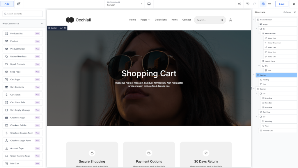
When it comes to a tool’s interface, it’s important that it’s easy to use, quick to navigate, and stays out of your way as much as possible.
Comparing Breakdance vs Elementor on an interface level, the two tools may look remarkably similar. But to see how close they really are, we need to dig a little more into some specific actions you’re likely to perform hundreds or thousands of times over the course of using the software.
Adding Elements and Widgets
First, let’s look at how Elementor handles adding widgets.
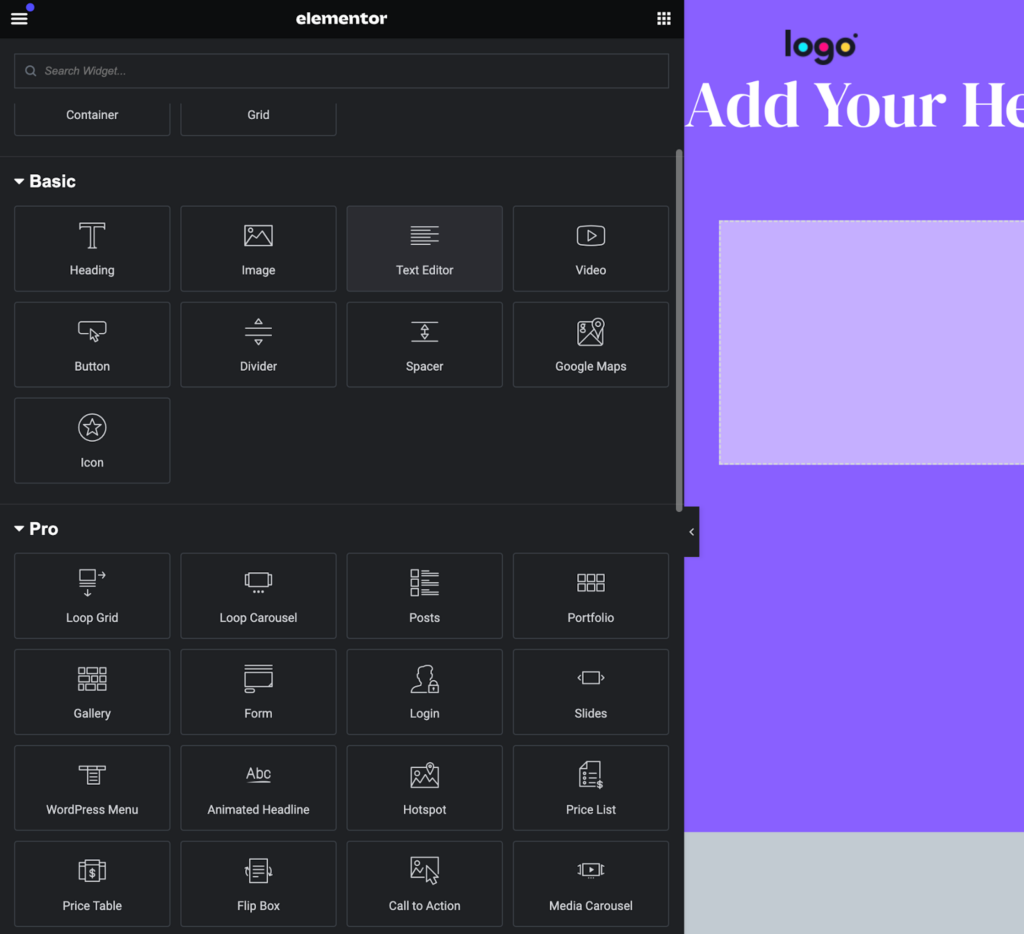
To add something new to your design, you have to click the widgets icon near the top left of the screen. There, you’ll be presented with a list of available widgets, which is searchable.
Next, you can type the name of the widget you’re looking for (or find it manually) and click or drag it into your design.
By comparison, Breakdance makes it much easier to add an element to your design.
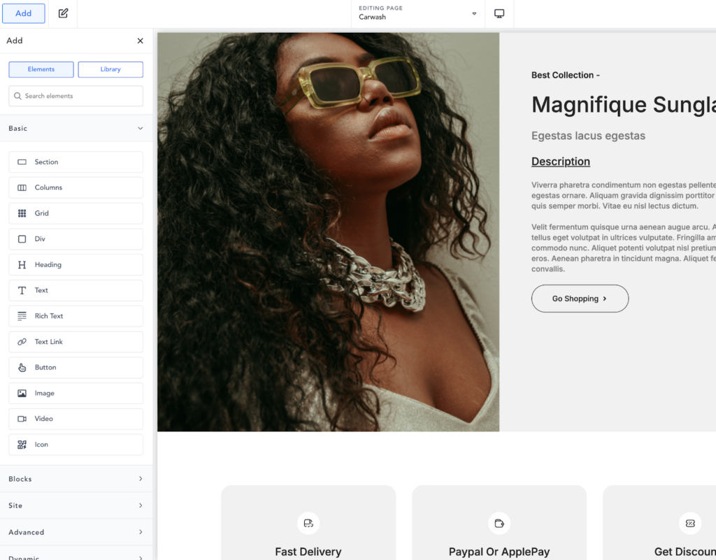
First, you just need to use the CMD/CTRL + A keyboard shortcut to open up the elements panel and focus the search box.
Next, type the name of the element you’re looking for. Instead of clicking or dragging it, the top result is highlighted automatically, so you can simply press enter to add the element to your design.
Though this difference may seem minute, reducing common actions by just a few clicks (and therefore, seconds) can save you hundreds of hours over the course of many projects.
This kind of streamlined workflow is present throughout Breakdance, which focuses on making every action as simple and fast as possible.
Adjusting Element and Widget Settings
Once you’ve added some elements (or widgets, as Elementor calls them), you’re going to want to tweak their settings and styles. Whether this is easy or inconvenient can make all the difference.
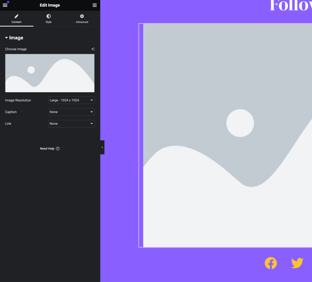
In Elementor, this is done via a left panel, sometimes called a properties panel. Once you click a widget in the design preview, the left panel is populated with the widget’s settings.
The controls are divided into three tabs: Content, Style, and Advanced.
In the Content tab, you’ll find controls for changing things like text content, links, and other similar settings.
Under the Style tab, you’ll find controls for changing styles such as typography, colors, and more.
In the Advanced tab, you’ll find (you guessed it) more advanced controls such as layout options, motion effects, and responsive settings.
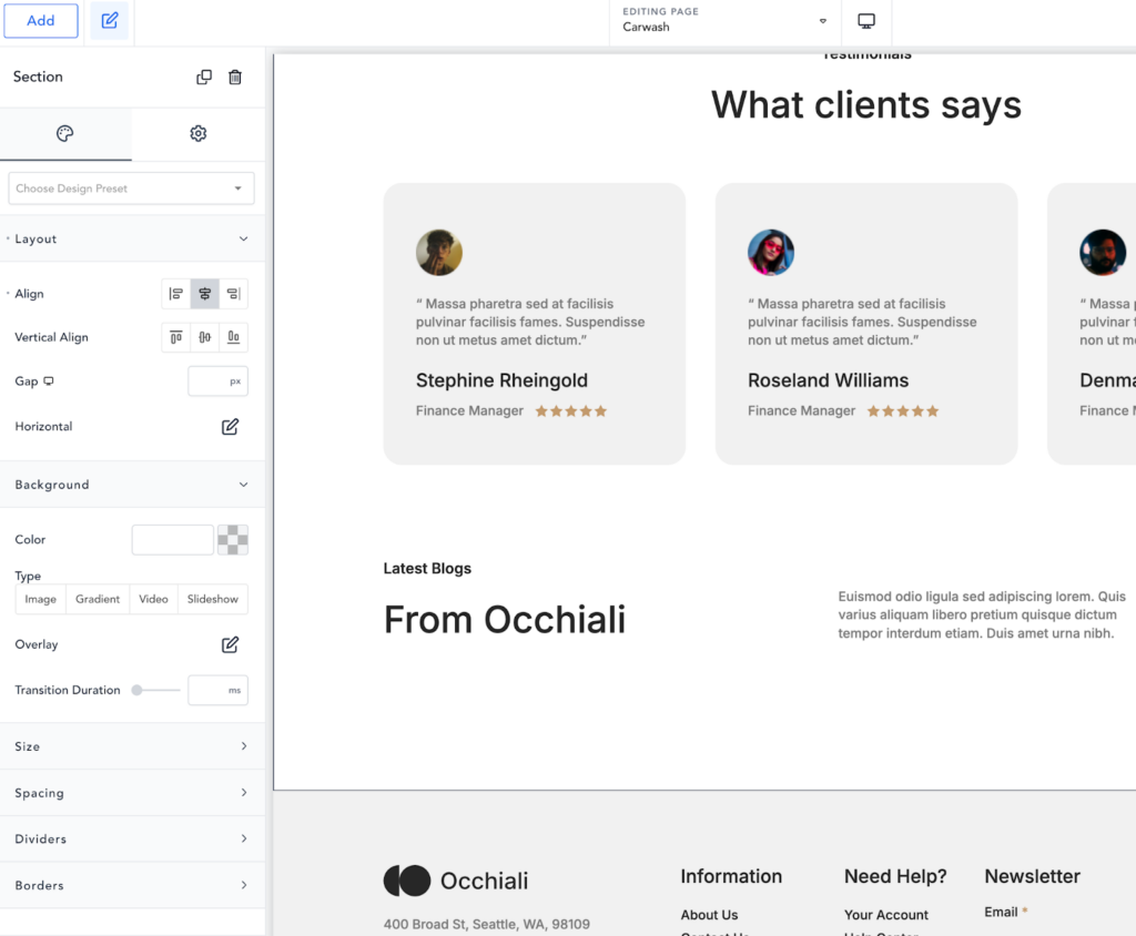
Breakdance’s properties panel is set up in a very similar fashion. It’s also divided into two or three tabs: Content, Style, and Settings.
Under the content tab, you’ll find a carefully selected set of controls for determining the content of your element. For text elements, this might include text content and HTML tags. For other elements, it will be a different set of controls.
In the Style tab, you’ll find all of the most commonly needed controls for visually styling the element. Notably, Breakdance includes layout options here instead of under an advanced tab, which can save you time. Layout is a common setting to tweak on many elements.
Finally, the Settings tab holds all of the expected advanced controls, including conditions, animations, and some responsive options.
The key difference here between Elementor vs Breakdance is that Breakdance features a search option for its properties panel.
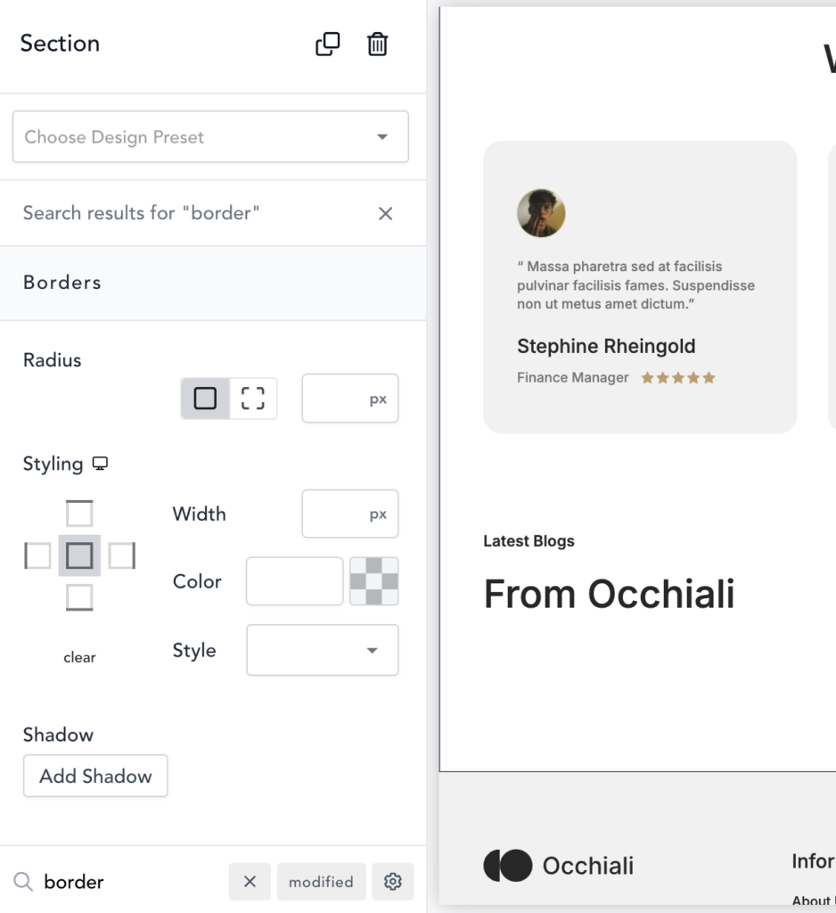
With this simple change, all settings are suddenly within your fingertips with minimal clicks. In fact, you can simply press F on your keyboard to focus the search box and start typing, with no clicks required. If you want to search for advanced options (such as position or z-index), press Shift + F to turn on the advanced search option and immediately focus the search box. In either case, you’ll be drilled down to the control you need in no time.
Previewing Your Design (Including Responsive Designs)
One thing you’re likely going to be doing a fair amount is swapping between breakpoints to tweak your design. While most modern builders have elements that gracefully collapse down as the viewport narrows, it’s almost always optimal to make a few manual tweaks to ensure everything fits your vision.
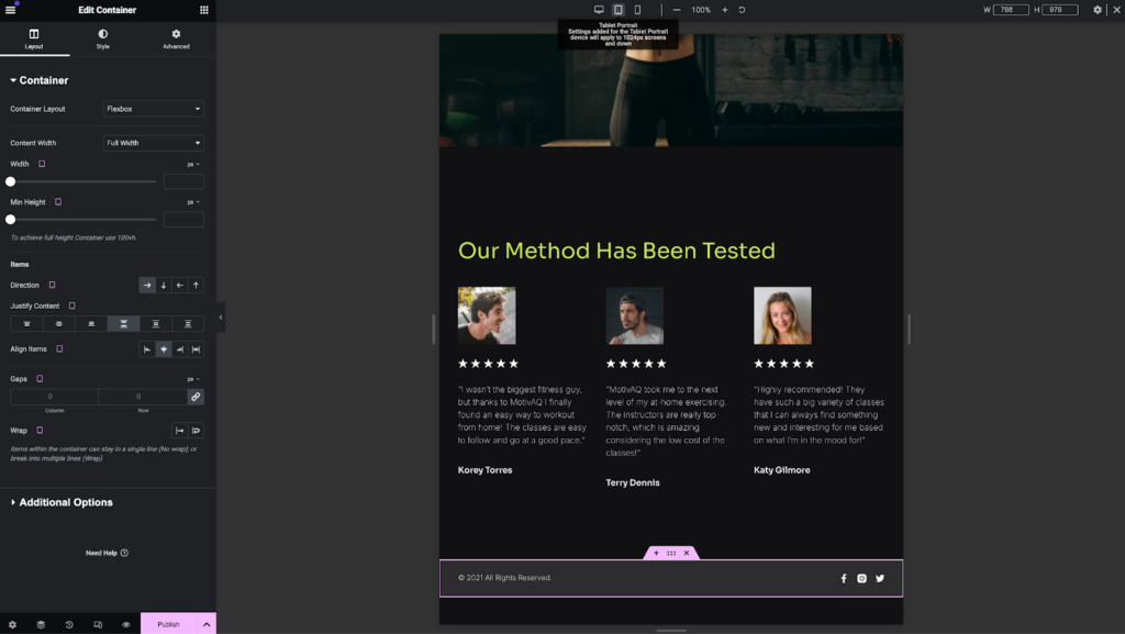
In Elementor, breakpoints (used for responsive design) are nestled under widget controls in the properties panel. By hovering next to a control’s name, you’ll be able to click on a tiny screen icon and swap between one of three built-in breakpoints. This causes the design preview to adjust to that size, which then reveals a responsive design control bar along the top of the builder.
Elementor does allow you to add some breakpoints for further flexibility, but this is limited to six pre-named options on which you can tweak the width.
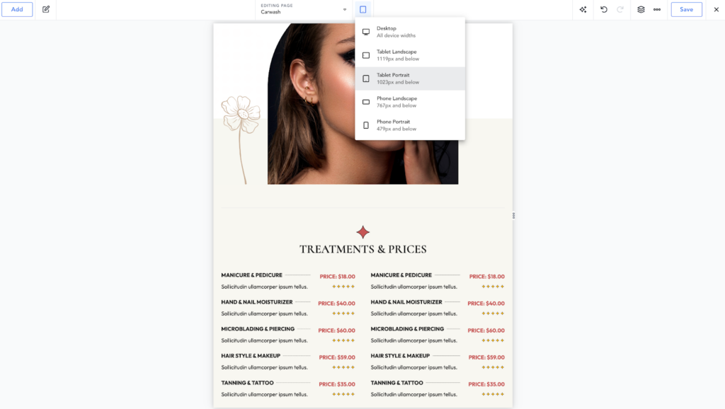
In Breakdance, responsive design is as good as second nature. At the top of the builder, there’s always a responsive breakpoint dropdown available to make it easy to swap viewport widths. Better yet, there’s a keyboard shortcut. Are you seeing a trend yet?
To use the keyboard shortcut, press CMD + Option + R on Mac or CTRL + Shift + R on Windows. This will cycle you to the next available breakpoint, giving you an accurate preview and allowing you to make adjustments on the fly.
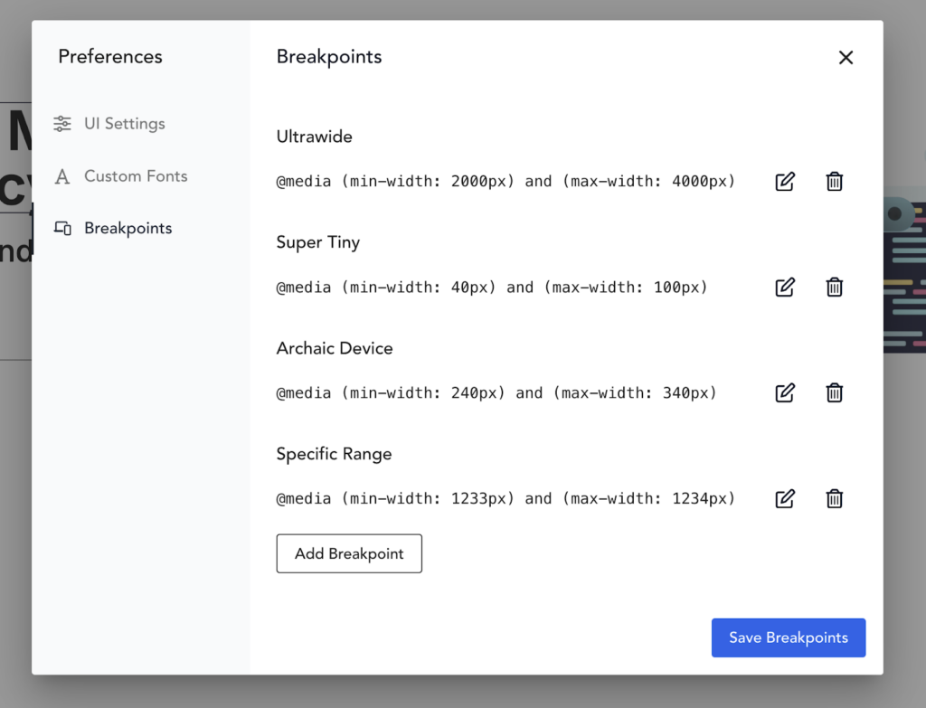
By default, Breakdance has 5 responsive breakpoints: Desktop, Tablet Landscape, Tablet Portrait, Phone Landscape, and Phone Portrait. You can also add an unlimited number of custom breakpoints via Breakdance’s preferences menu. This creates an opportunity for customizing your design at very specific viewport widths, meaning responsive design is easier than ever.
2. Breakdance vs Elementor: Performance
In recent years, performance has become a major discussion when it comes to comparing visual site builders like Elementor vs Breakdance.
Even though access to fast internet is better than ever, there are still a significant number of people that are on slow internet connections. This may be spotty satellite internet or 5G mobile internet that only intermittently works efficiently.
For these people, a small and fast-loading site is critical. Research has shown that slower load times mean higher bounce rates, which takes a huge chunk out of your website’s conversions and interactions.
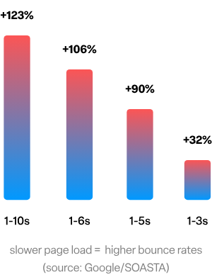
With that in mind, we are going to conduct some research of our own.
For this test, we’ll fire up a brand new demo site on InstaWP. One will have Elementor, and one will have Breakdance. On the homepage of each site, we’ll put the exact same elements:
- A heading.
- An image.
- Some plain text.
- A video embed.
Then, we’ll test both via Pingdom and see which one comes out faster.
Elementor’s Results
First, let’s take a look at the blank default sample page on the InstaWP site. We’ve made no changes at this point besides the fact that Elementor is installed and activated. Everything else is left at default.
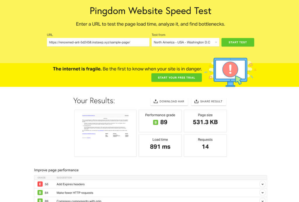
Let’s take a closer look at those results.
| Pingdom Results – Blank | Performance Grade | Page Size | Requests |
| Elementor | 89 (B) | 531.3 KB | 14 |
Not terrible out of the gate. Now let’s add our selection of test widgets to the page and re-run the test.
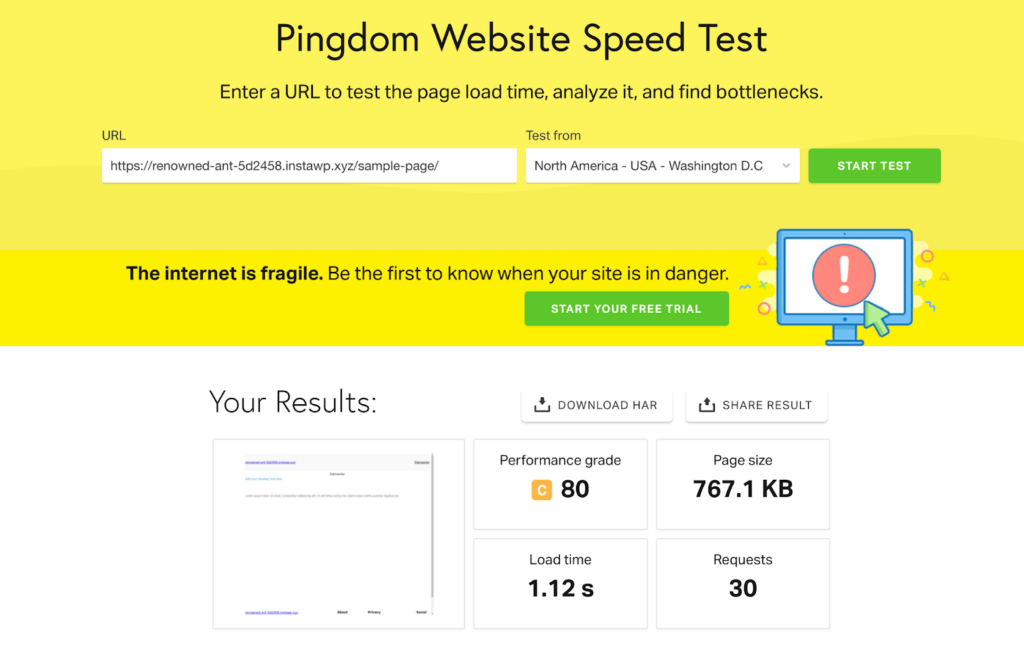
With just a few widgets added to the page, we see a 9 point performance grade drop, a 200+ KB page size increase, and a doubling of requests.
| Pingdom Results – With Widgets | Performance Grade | Page Size | Requests |
| Elementor | 80 (C) | 767.1 KB | 30 |
Breakdance’s Results
Next, let’s see how Breakdance’s blank page test compares.
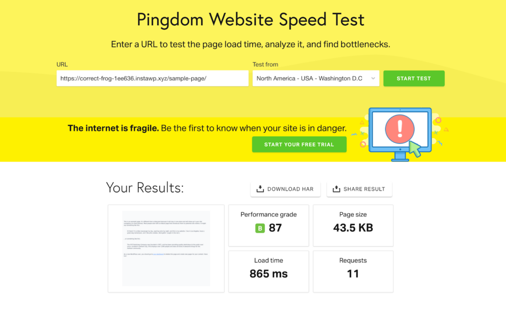
We can see immediately that the performance grade is similar, but the page size is much lower. The number of requests is also lower, while the load time is similar to Elementor’s blank page test. Since Breakdance disables the WordPress theme by default, much of the overhead you see on Elementor pages can be avoided.
| Pingdom Results – Blank | Performance Grade | Page Size | Requests |
| Breakdance | 87 (B) | 43.5 KB | 11 |
Now for the true test: How much do these performance metrics change once we add our test elements to the Breakdance test page? Let’s find out.
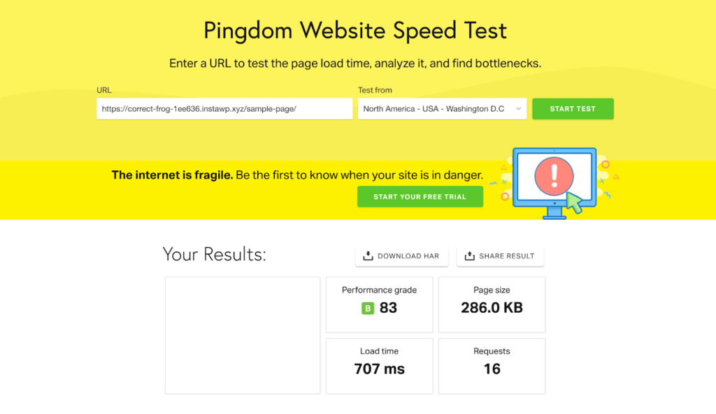
You can see a notable difference here: The performance grade does drop a few points but remains in the B rank. The page size increases to 286 KB, which is still incredibly small. The number of requests only increases by 5. This is evidence that pages built out using Breakdance are likely to be much more performant than pages built with Elementor.
| Pingdom Results – With Elements | Performance Grade | Page Size | Requests |
| Breakdance | 83 (B) | 286 KB | 16 |
With all of our tests performed, let’s take a look at both builders’ results side by side once elements and widgets have been added to the page.
| Pingdom Results – With Elements | Performance Grade | Page Size | Requests |
| Breakdance | 83 (B) | 286 KB | 16 |
| Elementor | 80 (C) | 767.1 KB | 30 |
3. Breakdance vs Elementor: Elements and Widgets
Another core consideration is how many elements or widgets come with your visual site builder of choice. When comparing Elementor vs Breakdance, it’s a good idea to take a look at the native building blocks included with the tools.
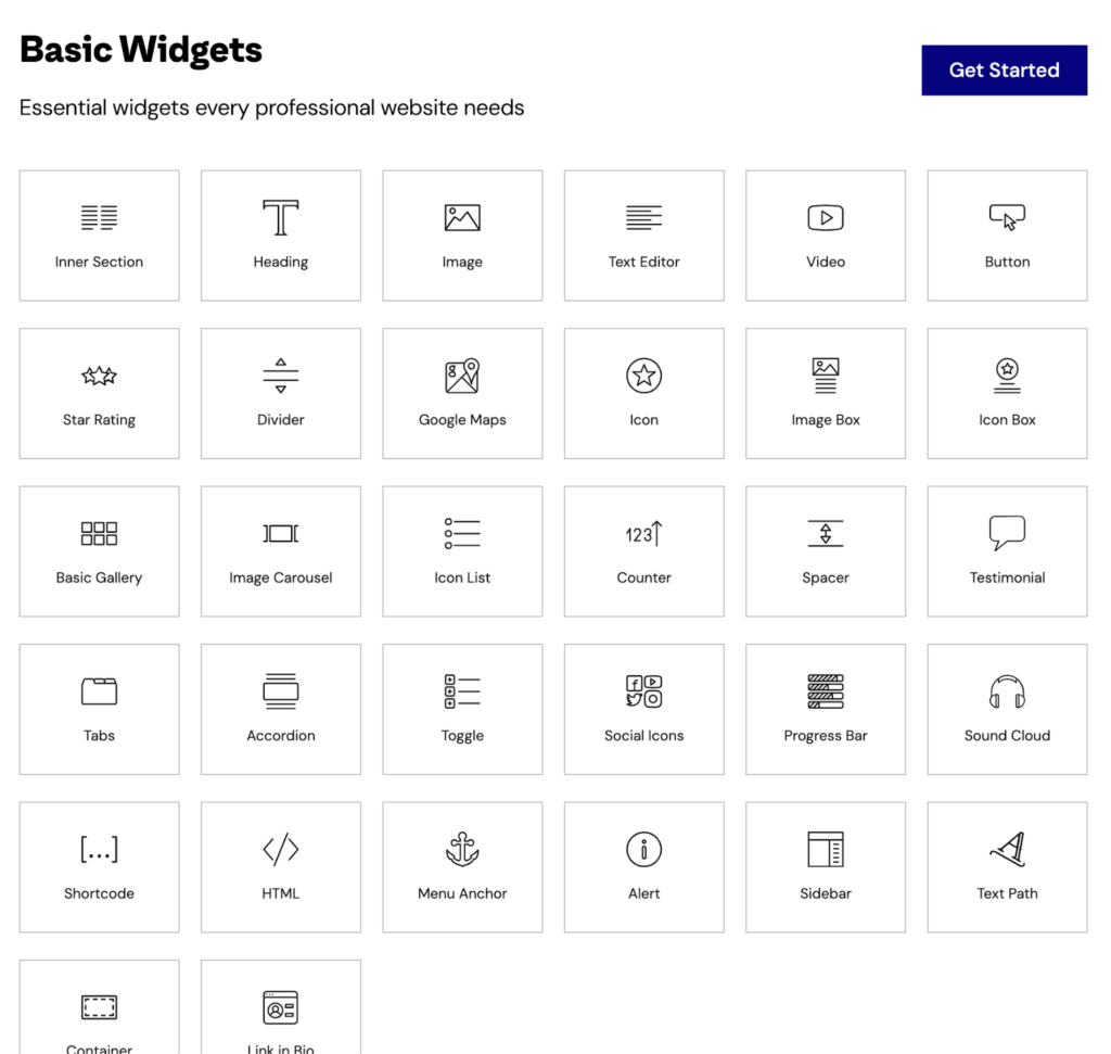
Elementor has around 106 built-in widgets available by default. The widgets are divided into a few categories: Basic Widgets, Pro Widgets, Theme Elements, and WooCommerce widgets.
There are plenty of widgets to choose from, but a few are notably missing. Specifically, widgets for advanced effects like SVG masks, scroll progress bars, and image hover cards aren’t available by default. Additionally, Elementor doesn’t have the ability to build complex menus or mega menus without enabling experimental options.
Next, let’s take a look at Breakdance’s included elements.
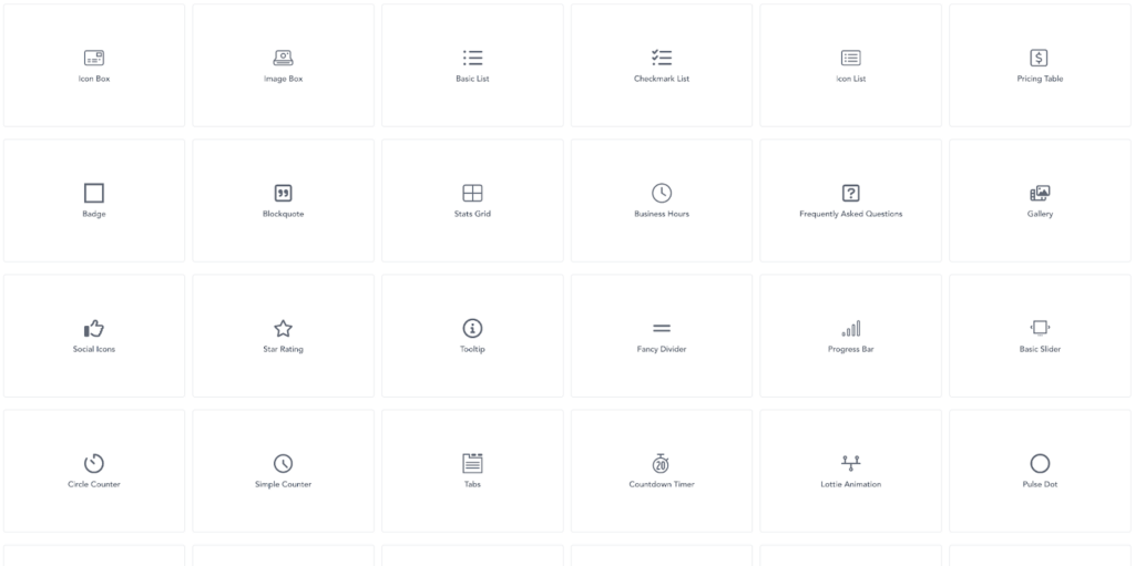
In Breakdance, you’ll find over 145 elements. These cover all of the basis, from basic text elements to dedicated Advanced Custom Fields repeater elements. They’re divided into a few categories as well: Basic, Blocks, Site, Advanced, Dynamic, Forms, and WooCommerce.
With this huge number of elements, it’s no surprise that Breakdance hits some of the areas that Elementor misses. Breakdance includes native masker, progress bar, and image hover card elements.
In the Blocks category, you’ll find some time-saving elements. These include elements such as the Stats grid for displaying stats or numbers, a Business Hours element to show when you’re open and closed, the Gallery element, a convenient Social Icons element, animated counters, and a dedicated element for displaying Lottie animations.
One remarkable element in the Advanced category is the Code Block. This element allows you to write CSS, HTML, JavaScript, and even PHP right in the builder. This isn’t something Elementor allows you to do, and it gives you the ability to fully customize your site without any limitations.
If the huge number of elements isn’t enough, Breakdance also features the world’s first element development IDE, called Element Studio. This tool allows you to visually modify elements, or build your own from scratch, right inside the builder with easy-to-use visual controls.
4. Breakdance vs Elementor: Global Styling
Global Styling is a way of designing common aspects of your site using a single, centralized interface. Generally, this includes things like colors and typography settings.
Global styling is important because it can save you hours and make your site look more professional.
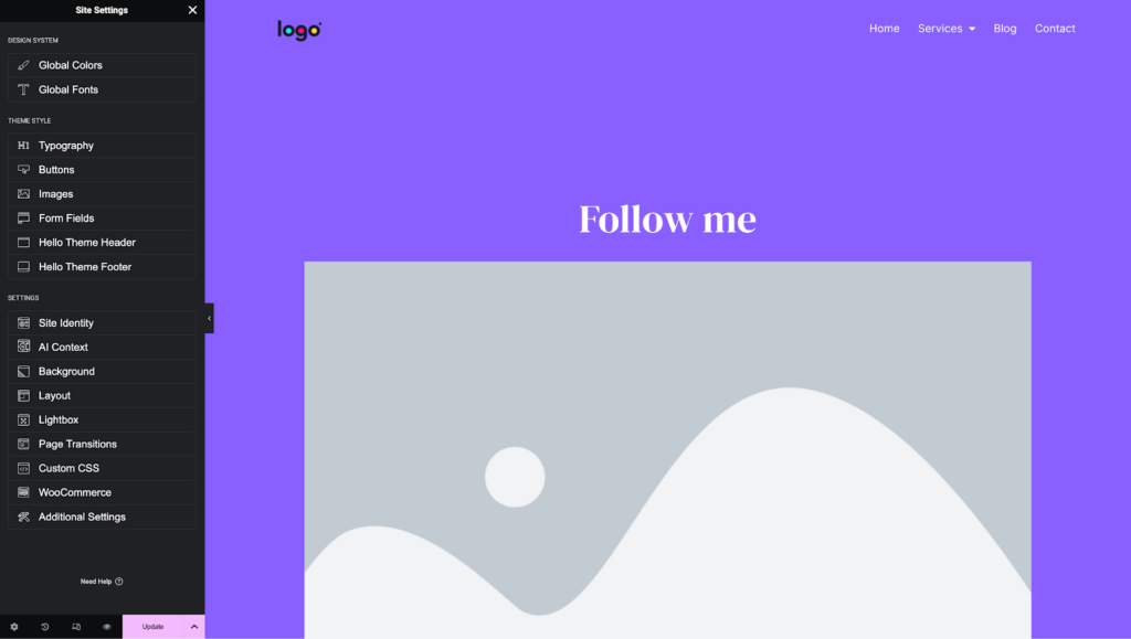
Under Elementor’s Site Settings, there are a few global styling options. These options allow you to set up your site’s typography, some button styles, image options, and a few more basics.
If we dive into the button settings, for instance, you’ll find that there’s a single panel of controls. These settings get applied to all button elements, making sure they look the same across your site. It would be nice if Elementor provided more than one global button style, but unfortunately, that’s not available.
Additionally, Elementor doesn’t have any global WooCommerce-specific settings. This means if you’re designing WooCommerce sites, it will take extra work to ensure all WooCommerce elements match your design and branding.
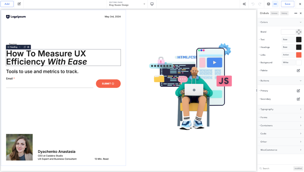
Breakdance really shines when it comes to global styling. That’s because it was built from the very beginning with a global-first approach. The idea in Breakdance is that you set all of your global styles first, which handles 99% of your site’s styles up front, then make tweaks to each element that needs to deviate from those global styles. Ideally, you’ll be making very few tweaks so that your site remains consistent and professional.
Breakdance also offers deeper global styles, with multiple button styles (Primary and Secondary) to give you an alternative option when you want certain CTAs to stand out while other buttons need to be more subdued.
There are deep typography controls, granular form styles, settings for containers, global JavaScript and CSS, and a full suite of WooCommerce-specific global styles that make building an e-commerce site incredibly fast.
5. Breakdance vs Elementor: Theme Builder
A theme builder feature is a relatively new development in page builders. Back in roughly 2018, most page builders didn’t concern themselves with aspects of the site that the WordPress theme normally handled.
Since then, it has become common for any modern visual site builder to allow you to design parts of the site normally handled by your theme: headers, footers, post templates, page templates, archive templates, and more.
If you’re using a visual site builder like Elementor or Breakdance, you likely want to have complete control over your site. That’s where theme builder features come into play.
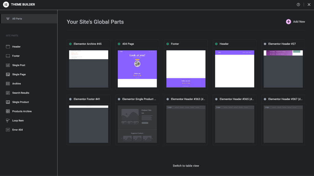
In Elementor Pro, you can use the theme builder interface to manage and design templates for your site. These cover a wide array of options: header, footer, single post, single page, archive, and more. Elementor’s theme builder feature even includes some WooCommerce template options, such as the products archive template type.
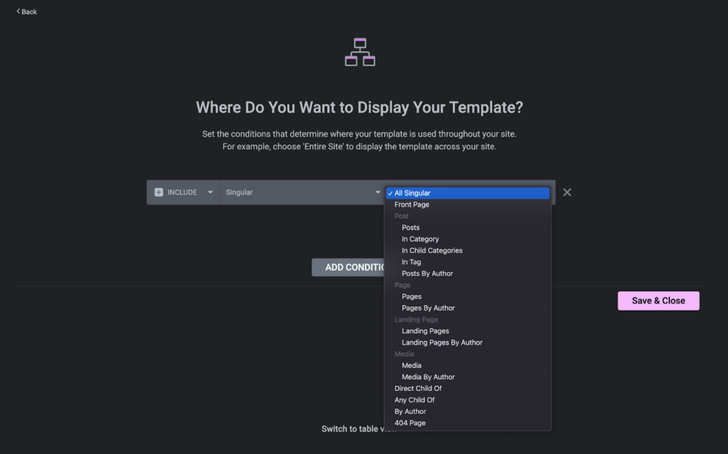
Elementor Pro’s theme builder feature also includes conditional settings to allow you to determine where your templates apply. This is incredibly important when building out a theme with a visual site builder.
Let’s take a look at how Breakdance handles theme builder functionality.
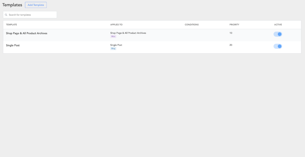
In Breakdance, an important fact to remember is that you can disable the WordPress theme entirely, meaning not only are you designing your theme with Breakdance, but none of the unneeded resources from the WordPress theme are ever being loaded.
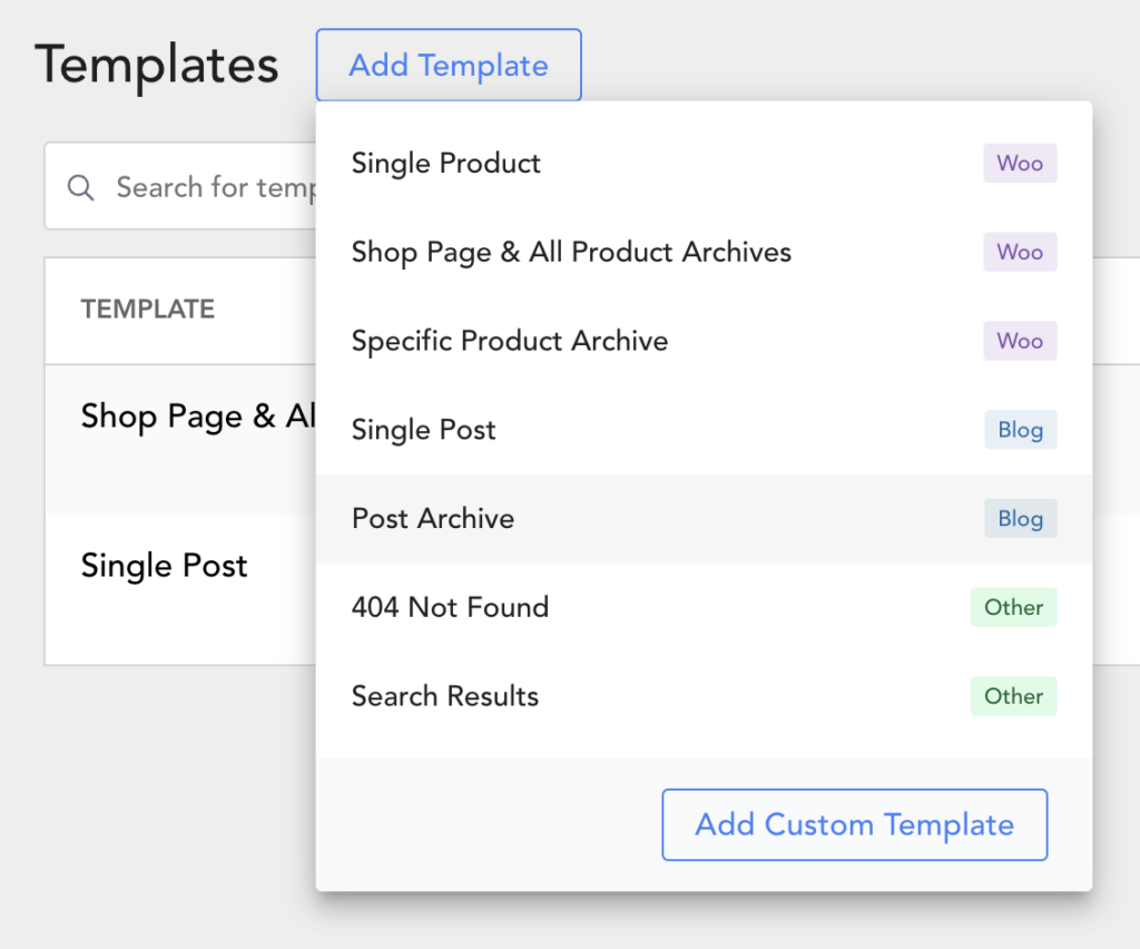
Breakdance allows you to create a variety of template types, or even custom template types that apply specifically where you need them to.
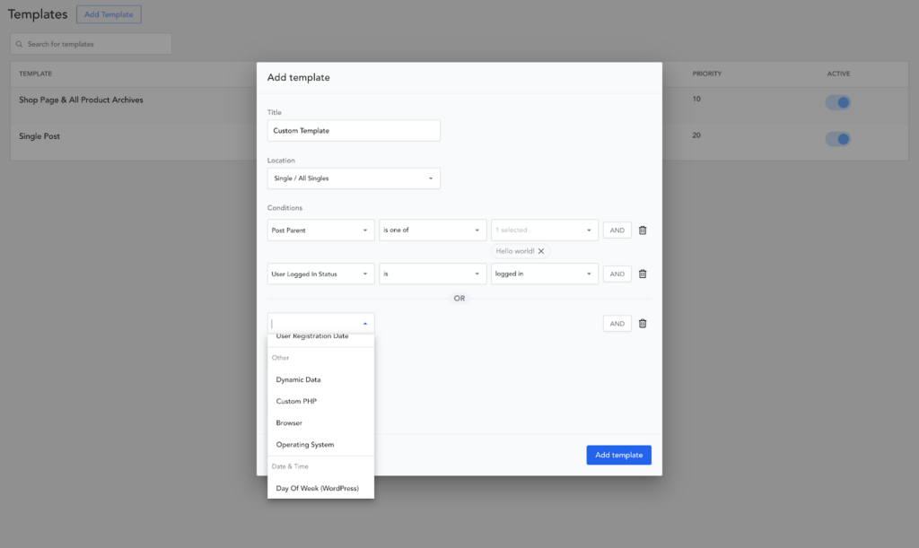
Breakdance’s conditions for templates are incredibly robust. You can combine conditions with AND and OR logic. You can even use dynamic data, custom PHP, and user logged-in status to determine where and when a template should be applied.
With this more fine-grained control over template applications, you’re able to build custom tailored template rules. This makes it easier to create highly custom websites.
Breakdance also allows you to build custom headers and footers. These can be turned on and off as needed, and include the same conditions options as other types of templates.
6. Breakdance vs Elementor: WooCommerce Builder
When we get into discussing Elementor vs Breakdance in terms of WooCommerce integrations, things get really interesting.
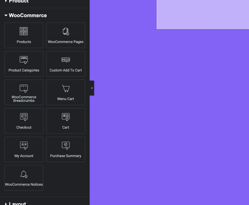
Elementor provides some basic integration with WooCommerce, including a selection of WooCommerce-specific widgets. These include the basics you’d expect, such as an add to cart button, product price widget, upsells, short description, product stock, and related products.
With this selection of widgets, you can granularly build out your individual product pages and get a much more custom look.
Unfortunately, Elementor’s strengths with WooCommerce begin to fade there. When it comes time to customize your cart and checkout page, you’ll find a limited number of options instead of the granular widgets available for individual products.
Need to build a custom product loop for your shop page? Out of luck. Elementor simply doesn’t include this option. This means your product archives and even your shop page are somewhat limited in the level of customization that can be achieved.
The final downside is global styling. As we discussed earlier, Elementor has no WooCommerce-specific global styling options. This means you’ll be designing each aspect of your store on a piecemeal basis, which takes a lot longer than styling everything from a central global styling interface.
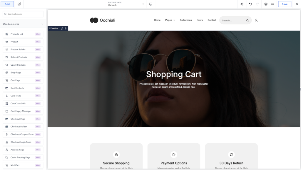
Breakdance set out from the very beginning to be the best visual site builder for WooCommerce stores. Even its default styles are beautiful, leaving you with little work to get a modern, attractive e-commerce site online.
With a huge number of WooCommerce elements, including granular elements for laying out your cart and checkout pages, you’ll be able to achieve a much more custom look more easily.
Breakdance even includes a product loop builder feature, which lets you build 100% custom product loops for your shop page, archives, and anywhere else you need to show a list of WooCommerce products.
Finally, the global styling that Breakdance offers for WooCommerce elements is unmatched. You can customize every aspect of your WooCommerce store on a global level, saving you hours of work.
7. Breakdance vs Elementor: Template Library
A large selection of templates can help a lot when building a website, especially if you’re new to design. By having some professionally designed options to lean on, you can save a lot of time and get a better result.
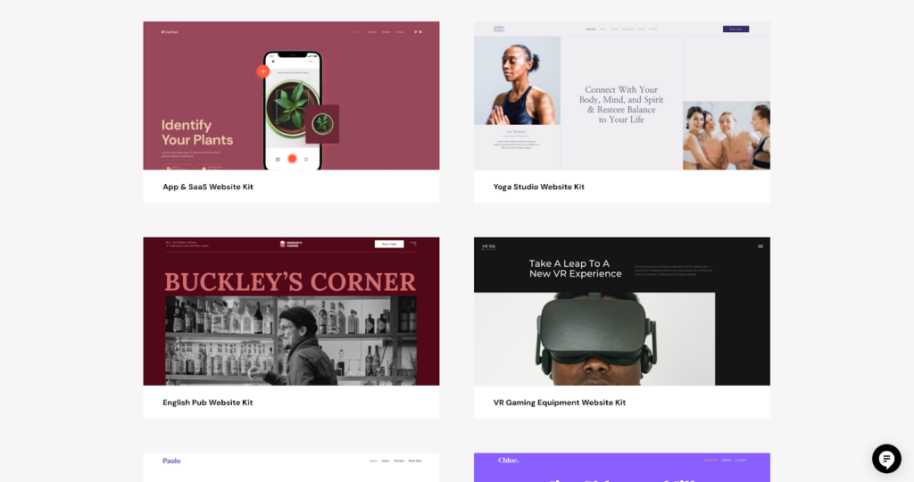
Elementor’s template library is broken down into block templates and full-page templates, as well as Template Kits in the Pro version.
In total, there are around 70 templates available in the free version, but over 300 are available in the Pro version. A lot of these are full page templates, which can be useful for building individual pages or complete sites.
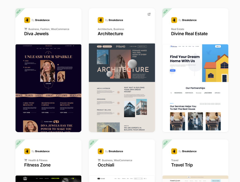
Breakdance’s template library takes a quality-over-quantity approach, with 38 complete site templates available by default.
Each template is professionally designed and has a number of individual sections as well as multiple complete pages that can be imported piecemeal or as a set.
Templates in Breakdance use global styles. This makes a huge difference when importing a new design. You can tweak one or two settings to completely alter the look of the entire site. For instance, changing the brand color in Global Settings after importing a template site will change it everywhere on that site.
8. Breakdance vs Elementor: Dynamic Data
Dynamic data is anything that is pulled from your site’s database or PHP code dynamically. This can be things like a post’s publish date, a user’s logged-in status, and much more.
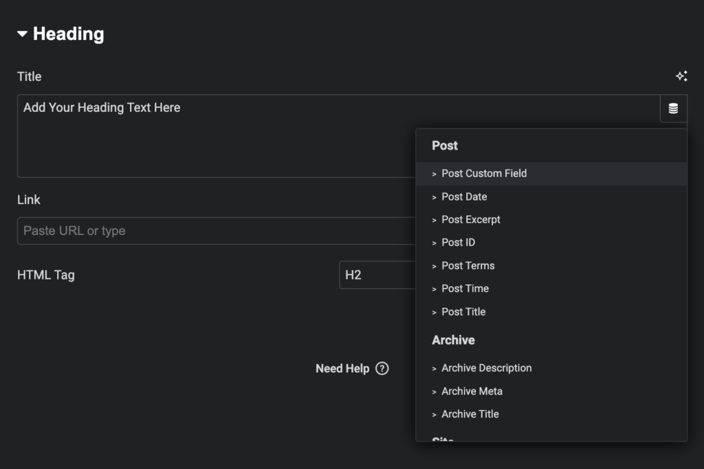
In Elementor, there are a total of 31 dynamic data tags for a text widget as of August 2024. These tags allow you to insert data into the text element: custom fields, post date, post ID, archive description, and more.
Elementor offers a reasonable amount of dynamic data tags. They cover most of the basics that you’d expect and allow you to create dynamic sites with data pulled from code or your site’s database.
When discussing dynamic data, you have to also think about conditions. Conditions allow you to display elements based on other factors, such as whether a user is logged in or logged out. There are far more use-cases for conditions, but user logged in status is a very common one.
Elementor does have element visibility conditions. Its selection of actual condition types is quite limited at roughly 16. This makes it harder to get the exact result you desire, as you’re restricted to the options they provide.
Third-party dynamic data plugins like Advanced Custom Fields (ACF) and Metabox are also very important for dynamic websites. Elementor has basic support for ACF, but no first-party support for Metabox. It also doesn’t have any native support for ACF repeaters or Metabox cloneable fields. This can be added via a paid third-party add-on.
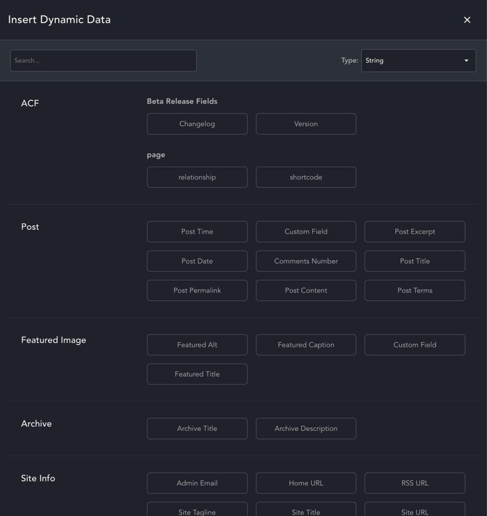
Breakdance has 36 dynamic data tags, resulting in far more capability and flexibility when working with dynamic data. Two unique tags, the “shortcode” and “URL Parameter” tags set Breakdance apart from Elementor in terms of dynamic data tags.
With 24 built-in conditions, Breakdance provides a great experience when making dynamic-data powered sites that need to be tailored to specific visitors or specific scenarios. The “Dynamic Data” condition allows you to show or hide an element by comparing it to dynamic data values – an absolute power-house feature that unlocks a large number of options. The “Custom PHP” condition allows you to control element visibility based on anything that can be evaluated in PHP. You can also register your own conditions using the Conditions API.
In addition to these excellent features, Breakdance also includes native support for Advanced Custom Fields (ACF) and Metabox, with no additional add-ons required. It includes a dedicated Repeater Field element which can be used to show lists of items from ACF repeater fields and Metabox cloneable fields.
9. Breakdance vs Elementor: Pricing Plans
Now that we have a better understanding of the features of each builder, as well as their strengths and weaknesses, it’s time to take a look at the final factor: price.
Elementor Pricing
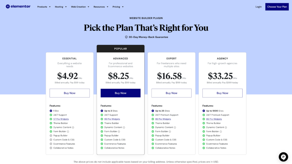
Elementor’s plans are clearly focused on DIYers over agencies, but they do offer an agency-level package with up to 1000 site activations.
The cheapest plan, which you’ll most likely start with if you’re building your own site, is $59 per year. This includes most features but notably excludes some Pro widgets, including only 57 of the 87 total widgets included in other plans.
If you need virtually unlimited sites, you’ll be paying $399 per year for the Agency plan. The unfortunate part is that it’s not actually unlimited – site activations are capped at 1000.
Breakdance Pricing
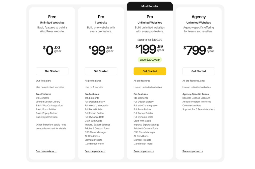
Breakdance pricing is slightly different, with their lowest plan being $99.99 per year. This plan does, however, include all of the features of the other Pro plans, but is limited to one site activation.
Luckily, if you plan on building lots of sites, Breakdance’s Unlimited plan gives you unlimited site activations for only $199.99 per year.
This pricing is attractive for prolific freelancers and agencies due to the unlimited nature of the license.
Also important to note is that due to the built-in features in Breakdance (145+ elements, premium form builder, popup builder, powerful conditions, fantastic dynamic data), you’ll save money overall vs Elementor due to not needing to buy extra third-party add-ons to fill the feature gaps.
Which is a Better WordPress Page Builder?
Overall, Breakdance has a better blend of pricing, features, usability, and pre-built templates. This makes it an ideal choice for everyone from beginners & DIYers to seasoned freelancers and agencies.
Where Elementor has some limitations that will either box you in or force you to write code yourself, Breakdance’s features allow far more flexibility before you end up having to get your hands dirty with PHP, HTML, CSS, or JS.
If you’re an advanced user, you’ll find the exact tools you need with elements like the Code Block, which allows you to write HTML, CSS, JS, and even PHP directly in the builder. There are a number of powerful APIs. And the innovative Element Studio feature isn’t available in any other builder on the market.
For the price conscious considering Elementor vs Breakdance, Breakdance is the only one of the pair to offer a truly unlimited license. This means you’ll never hit license caps and have to buy a second license to fit your capacity, which gives additional peace of mind.
On top of all of this, Breakdance is focused on delivering an excellent page builder experience, whereas it seems from Elementor’s website and marketing that they have their eye set on their hosting and other offerings as a revenue stream. This leads to some doubt as to how Elementor will continue to develop in the future.
If you’re ready to work with the modern visual site builder for WordPress, try Breakdance today. For those also considering Divi, this in-depth Elementor vs Divi comparison offers a detailed breakdown of how they stack up.
