Divi is one of the market leaders when it comes to WordPress page builders. Since 2013, this tool has presented WordPress developers with lots of advanced features. Is it still worth it in 2024? We’ll find out in this comprehensive Divi Builder review.
Designed by Elegant Themes, Divi is renowned for its flexible drag & drop features. While it doesn’t come with tons of content management and marketing options, it does well what it’s supposed to do. It aims to make web design in WordPress easy.
In this Divi builder review, we will discuss its key features, pros and cons, how it fares against its competitors, and if it’s worth using in 2024.
Overview of Divi Builder and Who Is It For
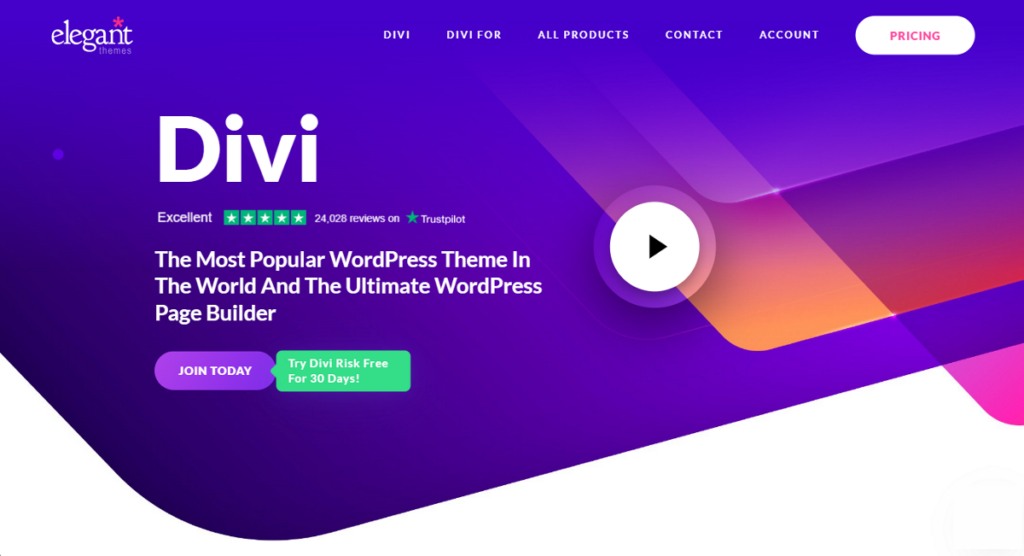
Starting at $89/year, Divi Builder is a premium plugin that allows you to access the Divi theme as well as the Divi Page Builder plugin.
One of the driving forces behind Divi’s popularity is its website templates, known as Website Packs. It’s a collection of pre-made designs and layouts for you to use on your website within minutes. At present, there are more than 300 website packs for its users to take advantage of.
Both of Divi’s subscriptions come with all these website packs, unlimited website management, and unlimited website usage.
That’s why this page builder is very much liked among web development agencies.
With Divi Pro, you’ll get to use Divi AI, an advanced AI website builder. The pro version comes with some more benefits, priced at $277/year.
Here’s a list of Divi’s key features:
- Visual site building and content editing
- Drag & drop interface
- Responsive editing
- Thousands of pre-made design layouts
- Global styles and elements
- 200+ content elements
- Hover state styling
- Filters and effects
- Mobile and desktop compatibility
- Custom code editing
- Incline text editing
- Email opt-in provider support
- Contact form building
- Built-in split testing
- WooCommerce integration
Basically, Divi is for people who are okay with paying a premium for a page builder that allows them to manage and design lots of websites.
If you are new to web design, we don’t recommend this builder. Competitors like Breakdance and Elementor have free versions, and beginners can try these instead.
Why Choose Divi Builder?
Divi Builder is a very handy tool if you are looking for an all-in-one solution to build a website from scratch.
With its integrated design and customization tools, you should be able to design a decent-looking website without any coding knowledge.
Another scenario where the Divi Builder works wonders is having a lot of websites to design and manage. Once you get your hands on a premium plan, Divi allows you to use the theme and plugin as many times as you want.
If you want to run a web design and development agency and want to use only one page builder, Divi can be a very good choice.
One of the best things about Divi is its collection of website packs and pre-made designs. No matter what kind of website you want to design, being able to choose 2000+ of these pre-made designs makes life a lot easier for starters.
However, despite being very good, Divi is not 100% perfect. It comes with a few cons that you need to take into account before making a purchase.
Let’s take a look at all the pros and cons of Divi Builder to help you out.
Pros of Divi Builder
- Lots of pre-made templates and layouts
- Wide variety of integrations and compatibility with other tools and plugins
- Convenient for both coders and non-coders
- Responsive design across all devices and browsers
- Extensive documentation for newbies
- Powerful AI website builder
- Split testing tools
- Great customer support
Cons of Divi Builder
- Stiff learning curve of the interface for beginners
- Overdependence on shortcodes
- Too many bloats
- WooCommerce builder with no granular controls for cart and checkout pages
- Below-average performance due to the addition of unnecessary divs
- More expensive compared to other page builders when you take into account that you’ll need to rely on third-party add-ons to add some features.
- No true global styling interface.
Divi Builder vs. the Competition
Among many page builders in the market, we believe the following two are worthy competitors of Divi Builder.
Breakdance
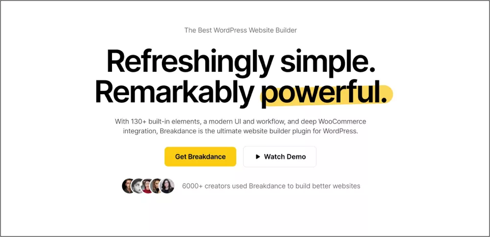
Breakdance is a modern page builder that comes with a clean, easy-to-use interface. It provides a fixed panel on the left and a blank canvas in the middle to design your website pages. This allows a lay user to effectively build websites with no prior experience.
With 145+ elements, Breakdance gives you more than enough to play with. You’ll barely need any third-party add-ons for specialized elements.
One of the unique features of Breakdance is its focus on Global Styles. Instead of designing each individual element, Breakdance allows you to set a shockingly large number of styles globally. These global styles apply everywhere on your site, meaning any element you drop in later will automatically match the global styles you set up. This is a huge time saver and helps you to build more consistent sites without fussing over individual styles on a per-element, or per-page basis.
It includes all the essential features such as a theme builder to design custom dynamic pages, a WooCommerce builder to design shop pages, a popup builder to design attractive popups, and a form element to add various lead and contact forms.
Breakdance built websites are also fast compared to Divi. This is mainly due to its focus on minimal nesting and fantastic semantics. The output is incredibly SEO-friendly as well. This makes Breakdance one of the best page builders to design your websites in 2024.
Starting at $99/year, Breakdance’s premium packages give you access to all features of the plugin.
Elementor
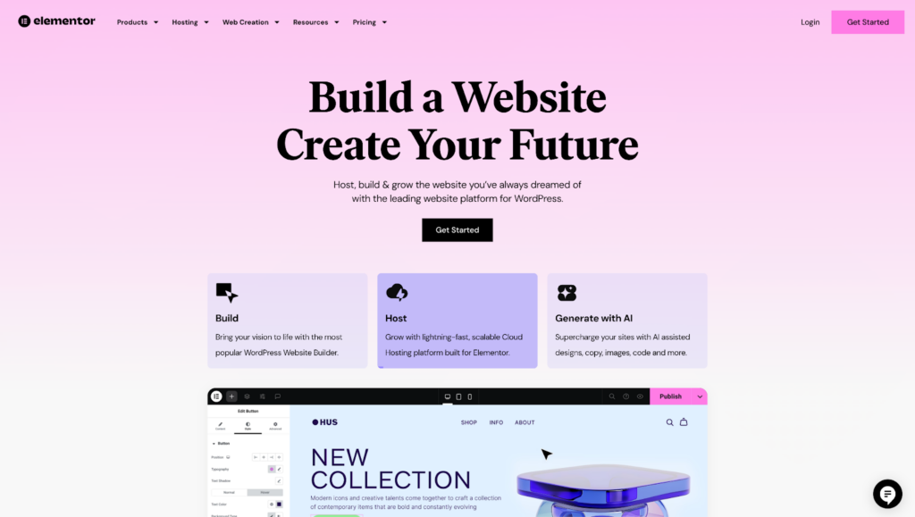
Elementor is another visual drag & drop website builder for WordPress. Just like Divi and Breakdance, you can build a complete website without touching a single line of code.
With millions of users worldwide, Elementor is one of the most popular page builders.
Elementor has a very simple UI, similar to what Breakdance offers. With hundreds of elements, or ‘widgets’, it allows you to build literally any page you want. Coupled with a quick finding tool, it allows you to get your website up and running fast.
Like Divi, Elementor also comes with tons of templates and layouts. These are divided into sections, full page, and full website templates.
Elementor is also compatible with WooCommerce and plugins like Pods, ACF, and Toolset, allowing you to highly customize your website. With dynamic content from custom fields, it is able to cater to a wide range of websites.
Elementor is a cheaper option than Divi. Its premium version starts at $59/year but lets you use it on a single website.
We will extensively compare Divi with these two competitors in a later part of the article.
How Does the Divi Builder Interface Work?
In this section, let’s take a look at how the Divi Builder interface works. We will guide you through how to create a page after installing Divi Builder.
Creating a New Page in Divi Builder
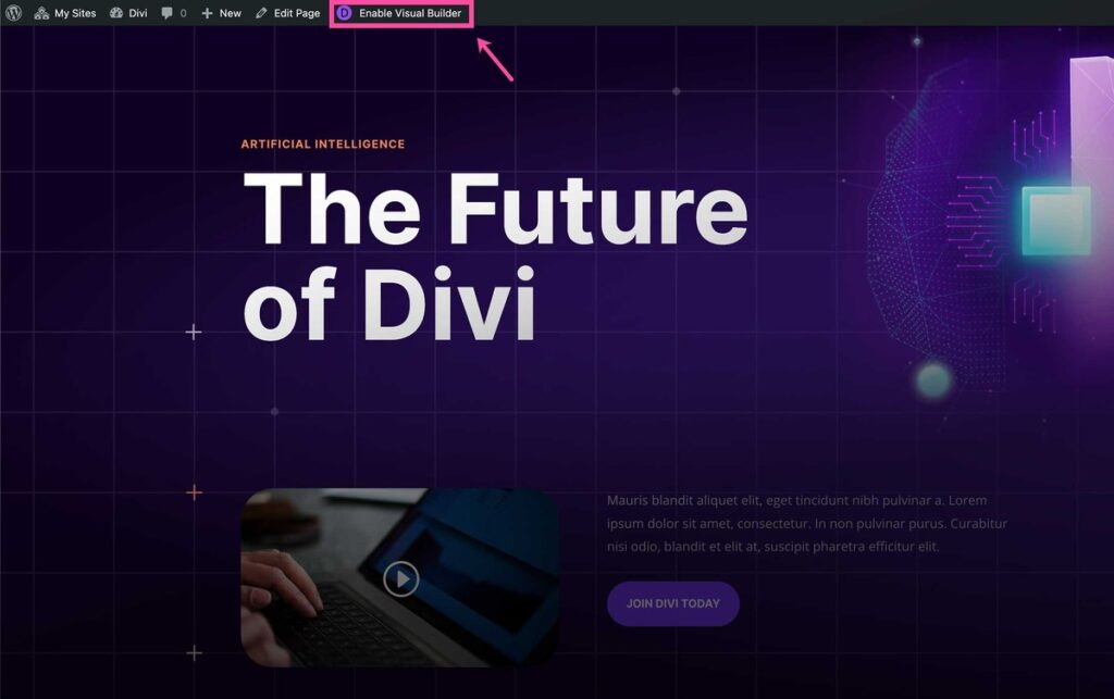
Once you are done installing Divi Builder, you’ll be able to access the Visual Builder on every page. Simply go to any page and Enable Visual Builder.
To build a new page, go to Page › Add New on your WordPress dashboard.
Click Use Divi Builder after giving your page a title. The page will then reload, and you’ll be able to edit the page with Divi.
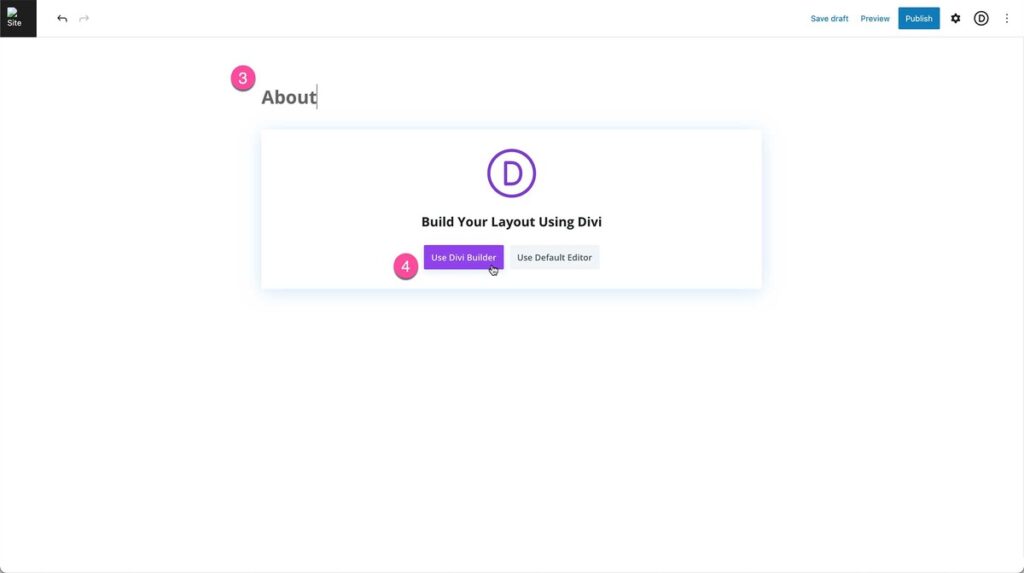
Once the page reloads, you’ll get three options:
- Build From Scratch
- Choose A Premade Layout
- Build with AI
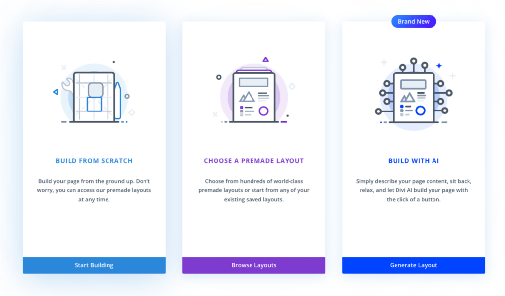
Build from Scratch
If you want to start with a clean slate, choose this option. It’ll simply load the builder with a blank page.
Choose a Premade Layout
If you want a premade layout and then customize it to your liking, choose this option. Divi Library has hundreds of layouts; choose one according to your liking.
Build with AI
This is a relatively new option. As the name suggests, it allows you to create your page with a text prompt and information about your website. It helps with both content and imagery.
For this demonstration, let’s try building a page from scratch.
The Divi Builder Interface
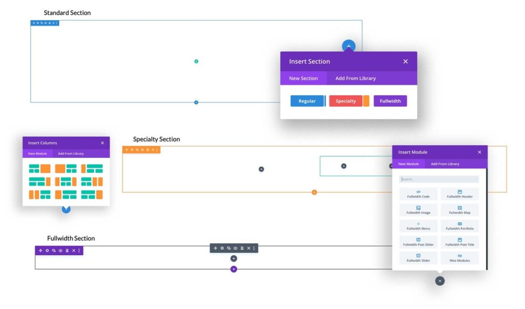
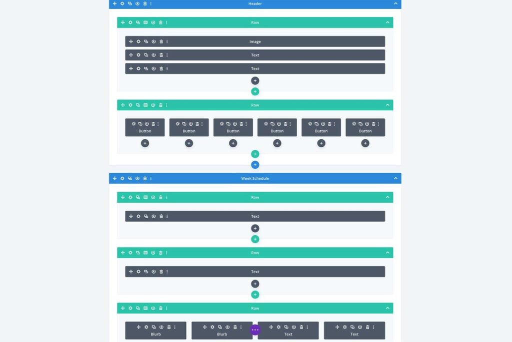
It comes with Sections, Rows, Columns, and Modules as the main building blocks. Sections contain Rows, Rows contain Columns, and Columns contain Modules.
Sections are the first building blocks in Divi. These horizontal stacking blocks group your content into distinguishable areas.
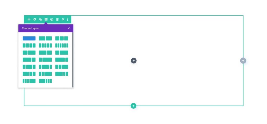
Rows help you with column layouts to structure your content.
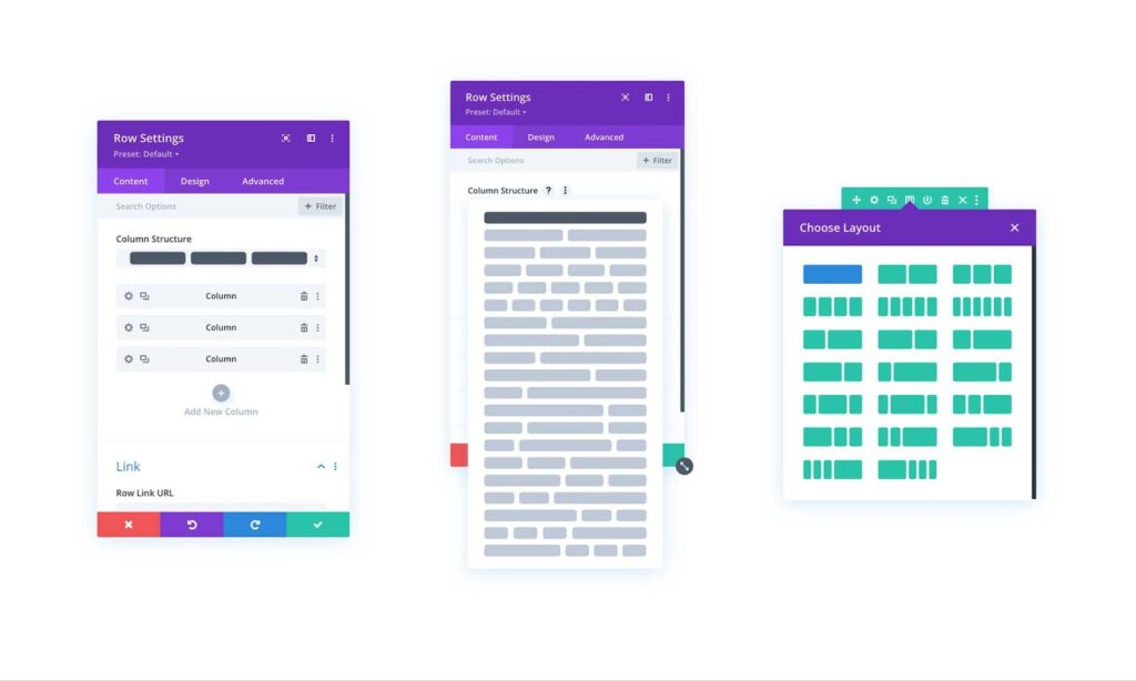
Columns are responsible for creating a boxed structure for your content.
Lastly, Modules are Divi’s content blocks. These include Text, Image, Slider, Blurb, Contact Form, and many more.
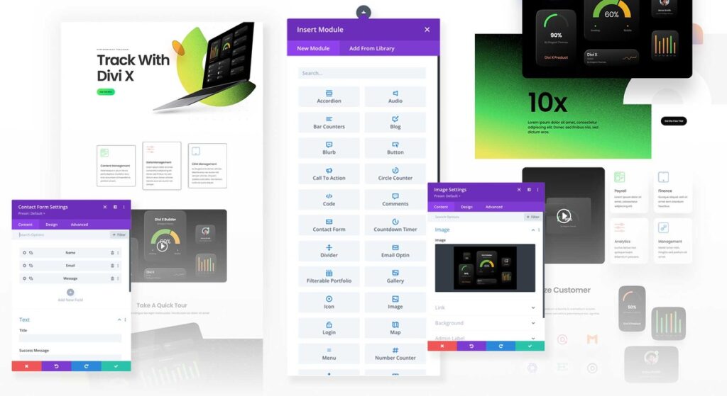
If you open any module, you’ll get a pop up window with customization options.
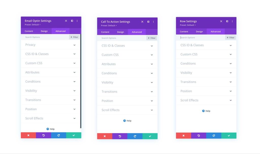
For each Module, there are three customization tabs available. These tabs include Content, Design, and Advanced and they help you make the module look exactly the way you want it to be.
Here’s an example of the Image module.
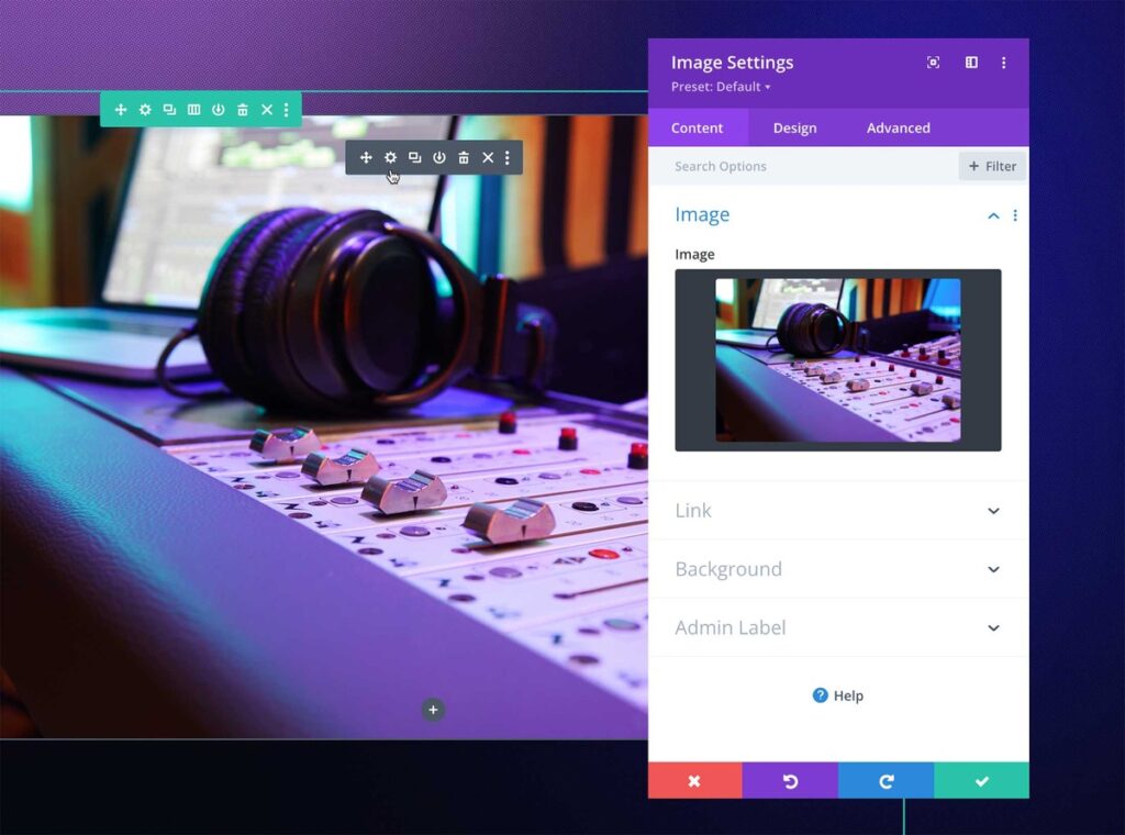
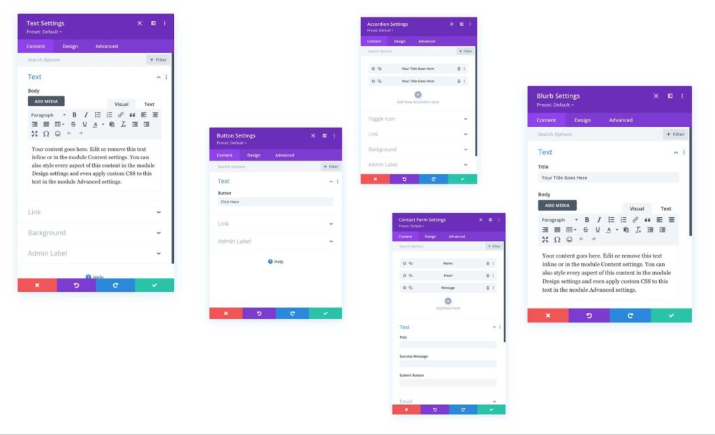
The Content Tab allows you to play with the content settings. Depending on the element you use, this tab provides you with varied options.
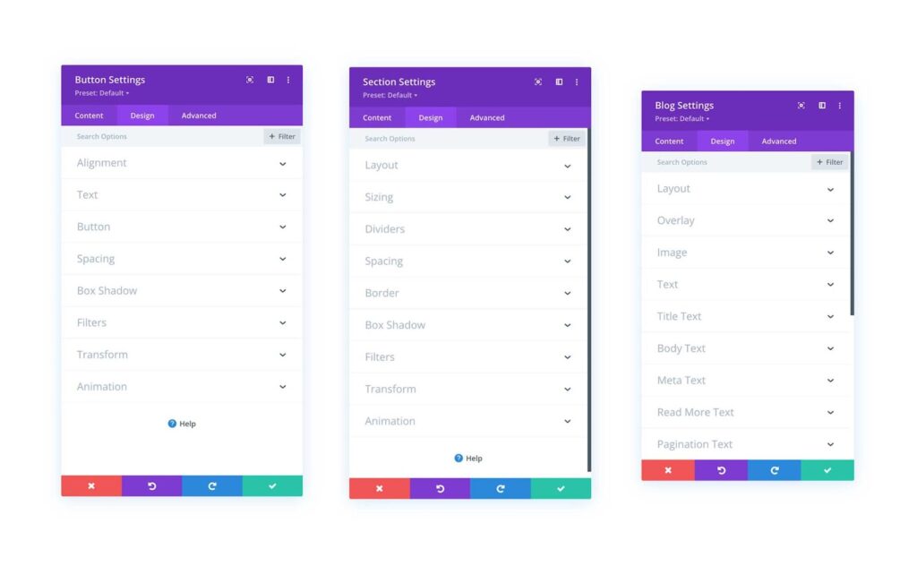
The Design Tab deals with the design settings like alignment, spacing, box shadow, and more. This tab also has varied options for each element.
The Advanced Tab provides advanced settings like Custom CSS, Visibility, Scroll Effects, Conditions, and more.
Responsive Editing
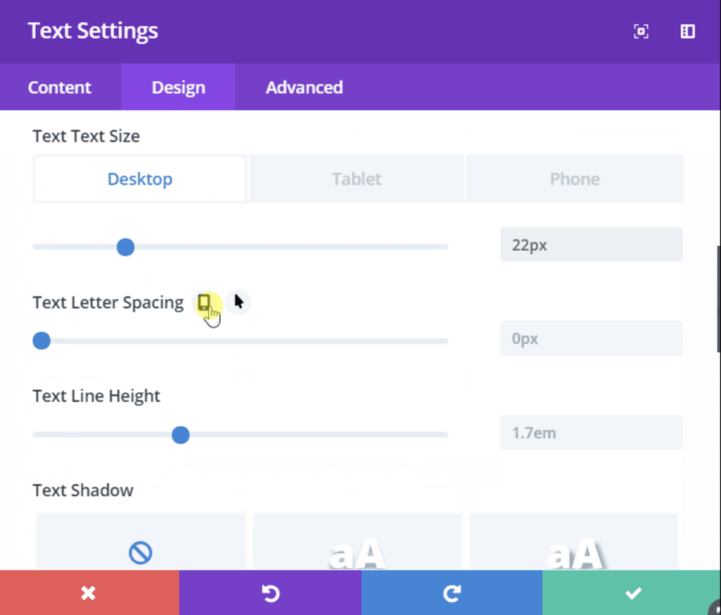
Divi is responsive by default, but you can make your website even more responsive using the customization options. You can even show the elements differently on different platforms and devices.
You can enable the responsive settings for any element. Go to element settings, and navigate to the Design Tab, and simply click on the Responsive icon. You can then adjust the element for Desktop, Tablet, or Phone.
Divi also provides its users with responsive preview options. Designers can see how their page will look on different devices before making them live.
Click on the Elipse icon to expand the Visual Builder toolbar, and use device preview icons to switch to different view modes. This way you will get Desktop, Tablet, and Phone previews.

Divi Builder Essential Features
Now that you have a basic understanding of Divi Builder’s UI, let’s discuss a few essential features that you may need to design your website.
Drag & Drop Interface
Divi comes with a drag-and-drop interface on the front end to design your website layouts. The front end will visually display your changes before publishing. To resize the elements, drag their sides to adjust settings.
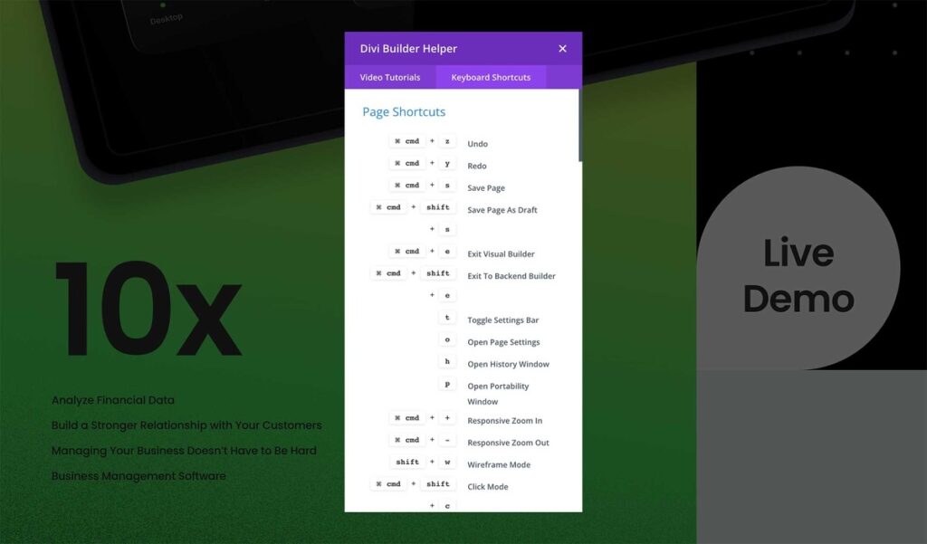
Keyboard Shortcuts
To make things easier, Divi offers a full range of keyboard shortcuts to speed up the users’ workflow.
Bulk Editing
Divi’s multi-select bulk editing options are quite capable. You can edit multiple elements simultaneously when necessary.
By pressing Cmd or Ctrl and clicking on each element you want to edit at once, you can select multiple elements at the same time. You can change their style, content, and even move them to different locations on your page.
Code Editing
Experienced designers can take advantage of Divi’s code editor to make advanced customizations to their pages. The code editor includes syntax highlighting, color picking, search, find and replace, auto-complete, error reporting, and many more features.
You can add Custom CSS to any element or add your code to any page.
Mobile and Wireframe View Modes
You can build your websites in multiple ways with Divi. There are different modes, including the wireframe mode. It’s easy to switch between modes to customize your pages as per your liking.
History and Browser Backups
Whatever action you perform while using Divi, everything is saved into your editing history. It is convenient to explore revisions and undo/redo your actions when necessary.
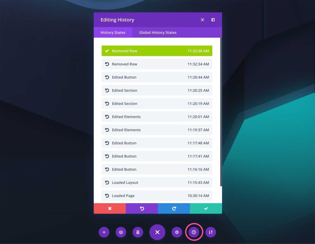
Divi automatically saves your progress to avoid instances like your computer crashing or the internet going down.
There you go! Now you have a good understanding of the Divi Builder interface!
7 Key Features of Divi Page Builder
Now, let’s have a look at the 7 major features of Divi Page Builder.
Pre-designed Template
Divi pre-designed templates make designing websites a lot faster. With Divi, you can access more than 370 premade layout packs which are divided between 2703 full page templates.
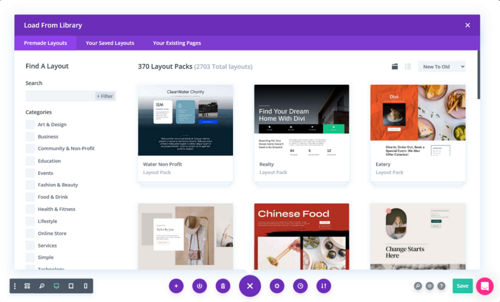
These layouts are great starting points for anyone who wants to get their website up and running in no time. They cover lots of niches, including ecommerce stores, blogs, portfolios, journals, and many more.
With readymade templates and the drag & drop interface, Divi makes it very convenient for people who haven’t designed websites before.
Divi Modules
Divi comes with a decent collection of content elements, which are also known as Modules. These are basically building blocks used to create your page layouts.
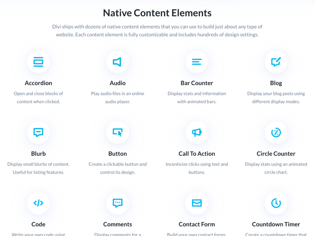
Thanks to the modules, you can drag & drop a wide variety of content elements to columns to bring your website to life.
Divi provides its users with a wide variety of modules, including text modules, image modules, slider modules, blog modules, contact form modules, ecommerce modules, and many more.
Divi Theme Builder
With Divi, you can design your own theme. Divi’s Theme Builder allows the designers to design website headers, footers, blog post templates, product templates, contact page templates, and many more.
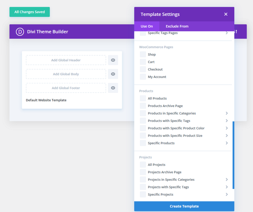
With the Divi Theme Builder, you can create theme templates and assign those templates to pages and posts across your theme. This is very useful if you want to design a custom website.
Divi WooCommerce Builder
Divi WooCommerce Builder has 16 built-in modules for WooCommere for designing custom shop pages, product pages, cart pages, checkout pages, and more.
The WooCommerce builder gives users full control over product pages. If you activate Divi Builder on a WooCommerce product, the standard product template automatically transforms into a collection of WooCommerce modules.
A/B Testing
Divi Builder also comes with A/B testing features, known as Split Testing. It allows you to display different versions of your page to different visitors.
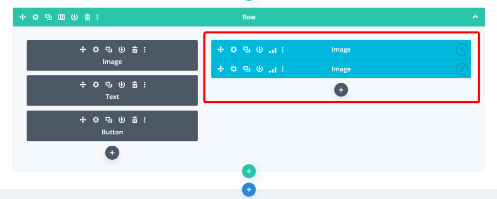
You can try different headings, colors, CTAs, and even entirely different layouts to test which version of your page performs better. Coupled with another feature called Divi Leads, you can create, manage, and track A/B tests with Divi.
Global Styles
Divi allows you to save builder elements as preset designs and use them across your entire website.
When you update a global element, the changes will automatically apply to anywhere else where that element appears.
If you need to use the same element in different sections of your page, this feature will save a lot of time and effort.
However, this method of creating element presets is not as efficient as the Global styles in Breakdance where you can control everything from a single page.
Contact Form Module and Integrations
Divi has a built-in contact form module in its Native Elements. You can create your customized contact form with a wide variety of field types. It also allows you to display or hide fields using conditional logic.
The Contact Form Module can seamlessly integrate with renowned contact form plugins like WPForms and Contact Form 7. However, it doesn’t have multi-step form options, which can be a bit annoying for some users.
Dynamic Data Support
You can turn any module into a dynamic element with Divi’s Dynamic Content feature. Dynamic elements pull information from your site’s database through post meta, post titles, featured images, published dates, and more.
You can use dynamic content in any module where you can enter content data. Divi’s dynamic data support is very helpful to users who want to create booking and listing websites, directories, membership sites, and more.
Divi Builder Performance
Speed is one of the crucial features of any page builder. You don’t want to be in a situation where your website looks stunning but takes minutes to load.
To accurately test the speed and performance of Divi Builder, we’ll conduct three separate page speed tests on InstaWP test sites. We’ll first perform the test on a blank WordPress website with the GeneratePress theme and no plugins installed. This gives us a baseline for how each plugin impacts site performance.
For the second test, we’ll install the Divi Builder and run the page test again. For the third test, we’ll create a test page with the following modules:
- Heading
- Text
- Button
- Image
- Feature section with three Image Boxes.
This test will help us understand the performance in a realistic real-world scenario. We’ll be conducting the test on both PageSpeed Insights and Pingdom Tools.
Let’s now look at the results of each page speed test.
Divi Page Speed Test Results
| Scenario | Page Size | Requests | Desktop | Mobile |
| Blank Website | 41.7 KB | 7 | 98 | 98 |
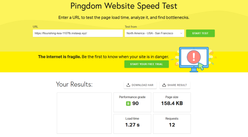
| With Divi Builder Installed | 158.4 KB | 12 | 98 | 94 |
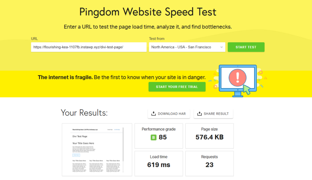
| Test Page | 576.4 KB | 23 | 93 | 89 |
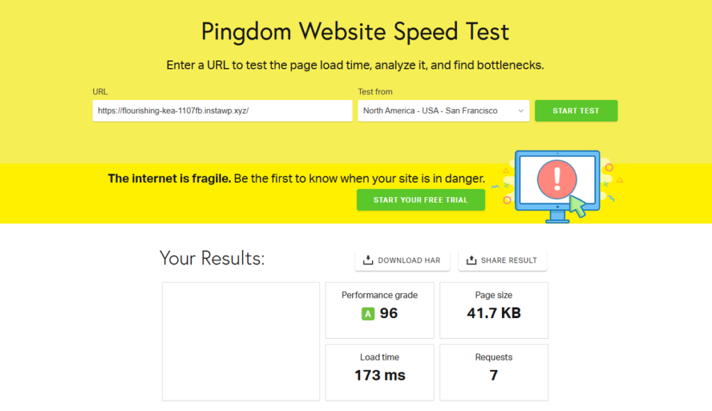
On a blank WordPress site, Divi recorded 41.7 KB page size and 31 HTTP requests. The PageSpeed Insights scores were 98 for desktop and 98 for mobile.
When we ran the test again with the plugin installed, Divi recorded 158.4 KB as the page size and 12 HTTP requests. The PageSpeed Insights scores were 98 for desktop and 94 for mobile.
After creating the test page and running the test again, the page size increased to 576.4 KB with 23 HTTP requests. PageSpeed Insights scores for the test page were 93 for desktop and 89 for mobile.
As you can see from the results, Divi is not the builder to choose if website speed is your priority. The test page results are average and will get worse as you start to add more modules to the page.
Divi Builder Alternatives
In this section, we are going to discuss the Divi Builder alternatives in more detail. The alternatives we recommend are Breakdance and Elementor.
Breakdance
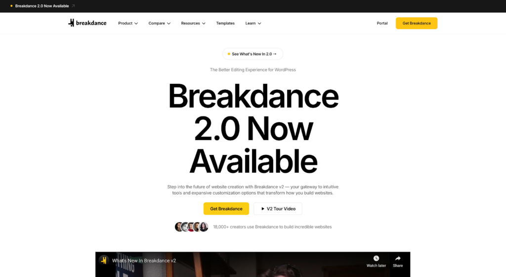
Breakdance is the best alternative to Divi Builder. It comes with 145 built-in elements, giving you complete flexibility to build any website or page you want.
Both offer drag & drop interface, but the interface in Breakdance feels more modern and easy to use. This is due to the fixed side panel on the side that most users will be already familiar with.
Breakdance building blocks are different. It uses columns, divs, or a grid as its building blocks. This makes it easy to create more complex layouts.
It also gives you more control over the layouts. It features CSS Flexbox, CSS Grid, Div Element, Gap Controls, Vertical Centering, Flex Elements, Flex Wrap, and many other layout controls that aren’t available on Divi.
Breakdance’s built-in form builder is hands down better than Divi’s. With Breakdance, you don’t need to install any third-party plugins to get the best out of your forms. It supports multi-steps forms, unlike Divi.
On top of having more types of forms compared to Divi, Breakdance’s forms have 15 field types, compared to Divi’s 6.
For WooCommerce store owners, Breakdance has a lot more to offer than Divi. Breakdance has 35 built-in Woo elements, while Divi has only 25. It also comes with Global Woo Styles, Search Products, Product Loop Builder, Filters, granular Checkout Builder, Dropdown Mini Cart, and many other essential tools that Divi doesn’t have.
When it comes to global styles, Breakdance saves a lot of time. You need to apply styles one-by-one per element, but you can apply site-wide global styles with Breakdance in a few clicks.
Your website performs better with Breakdance, as it doesn’t add tons of unnecessary divs to our code. Divi has way more bloats, which affects page performance if you have too many elements on it.
The cherry on top? Breakdance has a free version.
Divi, however, has a bigger template library than Breakdance. But it takes the quality over quantity approach.
Overall, Breakdance gives you a much better and more efficient page-building experience.
Check out this Divi vs Breakdance page for a more detailed comparison of each page builder and to better understand why Breakdance is better.
Elementor

Elementor has been Divi’s long-standing rival for a while and equally popular.
Elementor’s drag & drop actions rely on a fixed sidebar to manage elements instead of Divi’s floating widgets. This makes Elementor’s UI better, as floating widgets might confuse beginners.
Elementor also features a large library of templates and layouts, but Divi’s library is bigger. However, Elementor has more built-in widgets than Divi.
While both Elementor and Divi offer powerful page building capabilities, Divi Theme Builder integrates more deeply with its Divi Theme.
In terms of performance, Elementor fares better than Divi due to not having as many bloats. However, too many elements on a page can slow down performance for Elementor as well.
Unlike Divi, Elementor has a free version. Even though it’s quite limited, it gives an option to new designers to try it out for free before purchasing premium subscriptions.
Read this Divi vs Elementor comparison in detail to know more about the pros and cons of each page builder.
Divi Pricing Plans
Divi has two types of pricing, yearly and lifetime. For both types of pricing, Divi has two subscriptions named Divi and Divi Pro. The Divi plan costs $89/year and the Divi Pro plan costs $277/year.
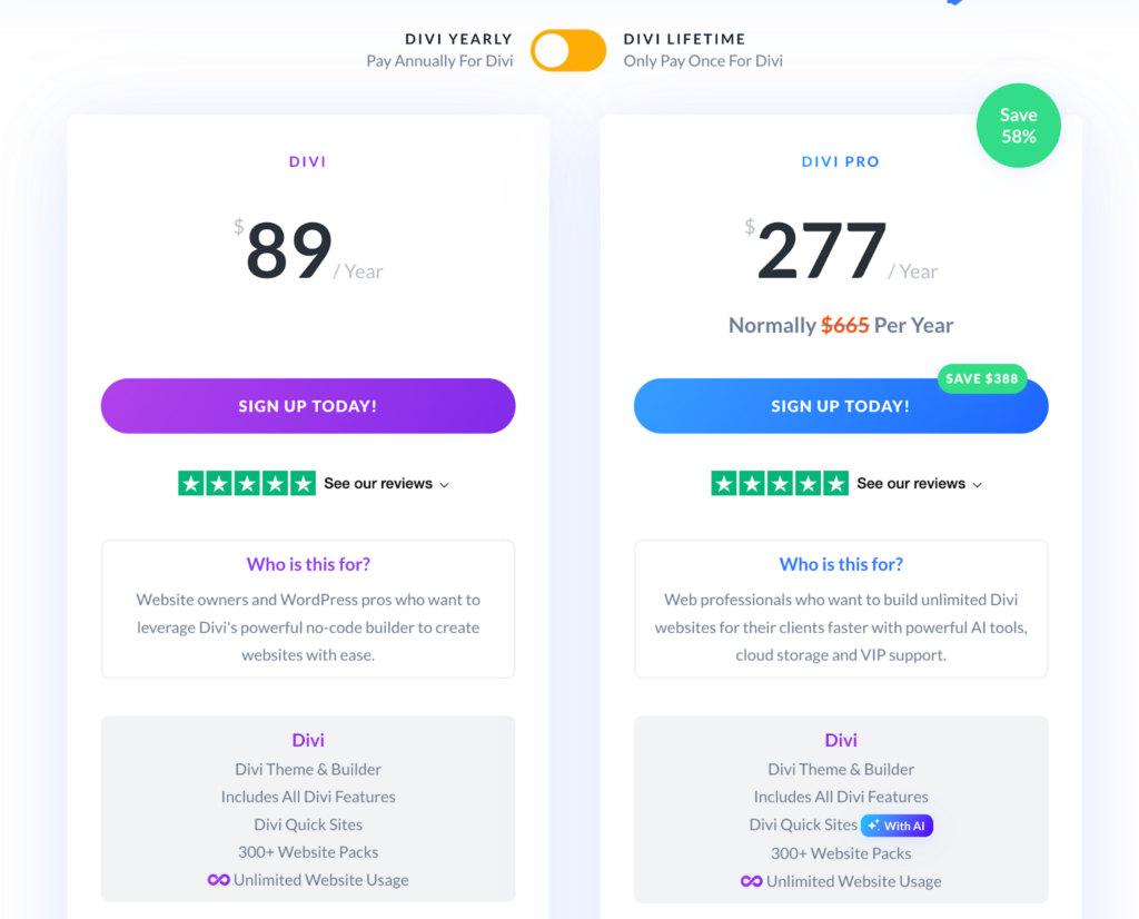
Features like Divi AI, Divi Cloud, Divi VIP, and Divi Teams are only available in the pro version.
As for the lifetime deals, the basic subscription costs $249. The pro version costs $297, but you need to pay $212 each following year to keep the pro service. Which somewhat makes the lifetime deal not so ‘lifetime’.
Divi Builder Review: Is It the Best WordPress Website Builder?
Divi is a pretty good page builder to design websites without writing codes. However, it does suffer from some performance issues due to bloats. Moreover, beginners may find it too overwhelming to get started with Divi.
Divi’s interface has too many popup windows, which can be confusing for someone who hasn’t used a builder before. Moreover, Divi misses out on features like multi-step forms, CSS flexbox, WooCommerce filtering options, menu builder, element studio, and quite a few others.
Breakdance, on the other hand, includes all of the above. It comes with a modern interface having a fixed sidebar that makes it easy to use, even for beginners. Due to not having bloats, Breakdance makes your pages load faster. Plus, it comes with a free plan!
Breakdance is a much better alternative to Divi. Try Breakdance today for free!
Frequently Asked Questions
Is Divi a good builder?
Divi is a very capable WordPress page builder with lots of pre-built layouts. However, it lacks some essential built-in features and comes with lots of bloats. For beginners, Divi might be too complicated to start with. Breakdance, on the other hand, is free from all these issues. It’s the best alternative to Divi.
Is Divi Builder better than Elementor?
Elementor is great for beginners due to its simple sidebar-based UI. Divi can be a bit complicated for newbies, but comes with an expansive library of pre-designed layouts. Both page builders are great in capable hands. However, Breakdance is a better builder than both Divi and Elementor due to its simplicity and customizability.
Is there anything better than Divi?
In terms of performance, Breakdance is much better than Divi. Due to having too many bloats, pages built with Divi may take longer to load. Divi also lacks lots of built-in features and needs third-party plugins to cover for it. Breakdance includes almost every feature you may need to design your site.
Is Divi Builder good for SEO?
Divi Builder is good for SEO if you integrate it with an SEO plugin. However, it adds a lot of divs to your page which might slow your site. That’s why it’s recommended to use Breakdance for SEO, as page speed is a very important search engine ranking factor.
Does Divi slow down your site?
Divi adds your content deep inside too many divs, which may slow down your site. If you truly care about your page speed, Breakdance is a better option as it
What is the best builder for WordPress?
Breakdance is the best builder for WordPress due to its ease of use, speed and performance, design flexibility, global design controls, and integrations.
